


 400 998 0226
 Tableau


 Tableau
 Minitab


 Alteryx


 Neo4j
Neo4j


 Talend


 IM
IM


 华为云
华为云 腾讯云
腾讯云 IT/安全
IT/安全


构建基本视图以浏览数据
- 版本 :2022.1 及更高版本
本主题使用示例 - 超级商店数据源演练如何创建基本视图和浏览数据。它显示了您在 Tableau 中的数据视图如何通过探索过程演变。 如果您使用 Tableau Online 和 Tableau Server 浏览数据和编辑视图,请参阅在 Web 上使用 Tableau。
连接到您的数据
第一步是连接到要浏览的数据。此示例演示如何连接到 Tableau Desktop 中的示例 - 超级商店数据。
打开 Tableau。在起始页上的“连接”下,单击“Microsoft Excel”。在“打开”对话框中,导航到计算机上的 Excel 文件。转到(G)。选择“示例 - 超级商店”,然后单击“打开”。
Sample - Superstore/Documents/My Tableau Repository/Datasources/version number/[language]连接到 Excel 数据后,数据源页面将显示数据中的工作表或表。将“订单”表拖到画布上以开始浏览该数据。
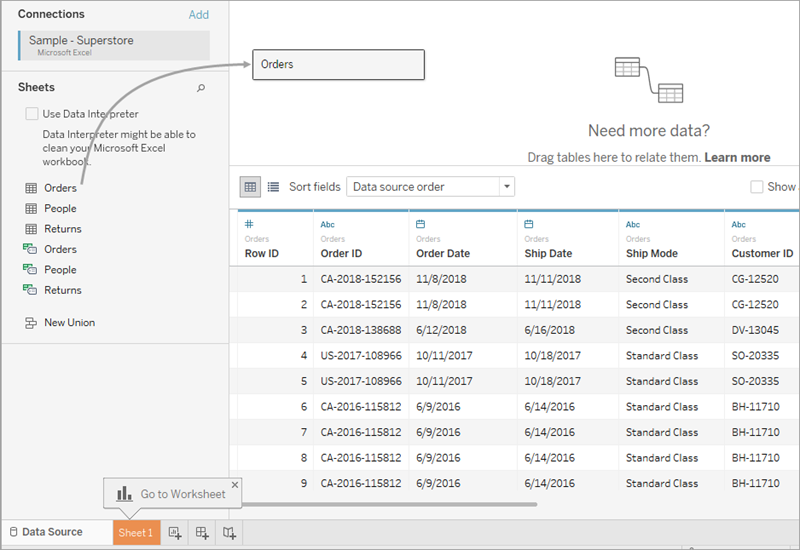
根据数据的结构,您可能需要在 Tableau 中开始浏览数据之前进行更多的数据准备和集成。有关连接到数据的更多详细信息,请参阅连接到和准备数据和处理数据的提示。
单击工作表选项卡以转到新工作表并开始分析。
关于“数据”窗格
在工作表中,数据源中的列在“数据”窗格的左侧显示为字段。“数据”窗格包含按表组织的各种字段。对于数据源中的每个表或文件夹,维度字段显示在灰线上方,度量字段显示在灰线下方。维度字段通常保存分类数据(如产品类型和日期),而度量字段保存数字数据(如销售额和利润)。在某些情况下,表或文件夹可能只包含维度,或者只包含要开始的度量。有关详细信息,请参阅维度和度量,蓝色和绿色。
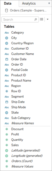
有关在“数据”窗格中查找字段的详细信息,请参阅查找字段。有关工作区各部分的详细信息,请参阅 Tableau 工作区。
如果工作簿中有多个数据源,请在“数据”窗格中单击数据源连接名称以选择它以供使用。有关更多详细信息,请参阅在“数据”窗格中导航数据源。
有关在数据窗格中自定义字段的多种方法的详细信息,请参阅在“数据”窗格中组织和自定义字段、编辑字段的默认设置和在“数据”窗格中使用数据字段。
如果您有相关的维度字段,有时您可能希望将它们分组到一个文件夹中,或者作为一个层次结构进行分组。例如,在此数据源中,“国家/地区”、“州”、“城市”和“邮政编码”分组到名为“位置”的层次结构中。您可以通过单击字段中的 + 号向下钻取到层次结构中,也可以通过单击字段中的 - 符号向上钻取。
构建视图
视图是您在 Tableau 中创建的可视化效果或可视化效果。可视化项可以是图表、图形、地图、绘图,甚至是文本表。
您在 Tableau 中构建的每个视图都应以一个问题开头。您想知道什么?
每次将字段拖到视图中或功能区上时,您都在询问有关数据的问题。问题将根据您拖动各种字段的位置、字段类型以及将字段拖动到视图中的顺序而有所不同。
对于您提出的每个问题,视图都会更改以直观地表示答案 - 带有标记(形状,文本,层次结构,表格结构,轴,颜色)。
开始构建视图的不同方法
生成视图时,可以从“数据”窗格中添加字段。您可以通过不同的方式执行此操作。
例如:
将字段从“数据”窗格中拖放到作为每个 Tableau 工作表一部分的卡片和功能区上。
双击“数据”窗格中的一个或多个字段。
在“数据”窗格中选择一个或多个字段,然后从“智能显示”中选择一种图表类型,该图表类型标识适用于所选字段的图表类型。有关详细信息,请参 阅使用“演示”启动视图 。
将字段拖放到此处的网格上,以开始从表格透视创建视图。

有关使用字段构建可视化的更多详细信息,请参阅通过将字段拖到视图中开始构建可视化效果。
当您开始在 Tableau 中浏览数据时,您会发现有很多方法可以构建视图。Tableau 非常灵活,也非常宽容。在构建视图时,如果您曾经走过一条没有回答您问题的路径,则始终可以撤消到探索中的上一点。
您可以一直撤消到上次打开工作簿的时间。您可以撤消或重做无限次。
要撤消或重做,请单击工具栏上的撤消
 或重做
或重做 。
。
从头开始构建视图
这些步骤演示如何构建显示逐年利润的基本视图。
从“数据”窗格的“维度”区域中,将“订单日期”字段拖到“列”功能区。您可能需要展开“订单”层次结构才能看到“订单日期”。
将字段拖到功能区上时,加号表示功能区可以接受该字段。

生成的表有四列和一行。每个列标题表示“订单日期”字段的一个成员(默认日期级别为 YEAR)。每个单元格都包含一个“Abc”标签,该标签指示此视图的当前标记类型是文本。

请注意,该字段为蓝色,这表示它是离散的。有关详细信息,请参阅维度和度量,蓝色和绿色。
默认日期级别由包含多个不同值(例如,多年和多个月)的最高级别确定。这意味着,如果 [订单日期] 仅包含一年的数据,但包含多个月,则默认级别将为月。您可以使用字段菜单更改日期级别。

If you're wondering why there are two sets of date levels (from Year down to Day), the first set of options uses date parts and the second set of options uses date values. For more information, see Change Date Levels.
Tip: To hide the title on the sheet, select the drop-down to the right of the title (Sheet 1), and select Hide Title.
From the Data pane, drag the Profit field to the Rows shelf.

The Profit field is colored green on the Rows shelf, indicating that it is continuous. Also, the field name changes to SUM(Profit). That’s because measures are automatically aggregated when you add them to the view, and the default aggregation for this measure is SUM. For more information on what happens when you add a measure to a view—and why—see Dimensions and Measures, Blue and Green.
Tableau transforms the table into a line chart and creates a vertical axis (along the left side) for the measure.
A line chart is a great way to compare data over time and identify trends effectively.
This line chart shows profit over time. Each point along the line shows the sum of profit for the corresponding year.

The next step is to drill a little deeper into the time dimension.
Drill into the data
This step shows how you can modify the view to show quarters in addition to years. As you drill down into the hierarchy, the view changes to become a nested table.
You can show [Order Date] by quarters using either of the following methods:
The new dimension divides the view into separate panes for each year. Each pane, in turn, has columns for quarters. This view is called a nested table because it displays multiple headers, with quarters nested within years. The word "headers" might be a bit misleading because while the year headers remain at the "head" of the view (that is, the top), the quarter headers are at the foot (that is, the bottom). So it might be more accurate to call them footers.

Increase the level of detail with small multiples
This step shows how you can modify the nested table view to add customer segment. This will create a small multiples view.
Drag the Segment dimension from the Data pane. Drop it just to the left of SUM(Profit) on Rows.

The field is added to the Rows shelf and row headers are created. Each header represents a member of the Segment field.
You could achieve the same result by dropping Segment just to the left of the Profit axis in the view (show below). Tableau often supports multiple ways to add fields to the view.

Note: Tableau does not allow you to place a dimension to the right of a measure on either the Rows or Columns shelves because that visual structure would not make sense in the view.
The new dimension divides the view into 12 panes, one for each combination of year and segment. This view is a more complex example of a nested table. Any view that contains this sort of grid of individual charts is referred to as a small multiples view.

At this point you probably don't want to make the view any more granular; in fact, you may want to simplify the view by removing (that is, filtering) some data.
Filter the view to focus your exploration
This section shows how you can focus your exploration by only showing a subset of the data, such as modifying the view to show only data for orders in 2012 and 2013.
The view updates to only show data rows where Order Date is 2018 or 2019. Tableau can now allocate more space to the data that interests you.

Next, you will increase the detail in your data exploration by dragging a field to Color on the Marks card.
Use the Marks card to add depth to your analysis
This step shows how you can modify the view to color the marks based on the region.
Click the plus button
 on the left side of the field YEAR(Order Date) field on Columns.
Drag the Order Date field (again) from the Data pane and drop it on the Columns shelf to the right of Year(Order Date).
Drag the Region dimension from the Data pane and drop it on Color.
Placing a dimension on Color separates the marks according to the members in the dimension, and assigns a unique color to each member. The color legend displays each member name and its associated color.

Each pane now has four lines, one for each region. The viz is now showing profit data summarized the Region level of detail.
This view now shows profit for each customer segment and region for 2012 and 2013.

For more information on the Marks card and level of detail, see Shelves and Cards Reference, Marks, and How dimensions affect the level of detail in the view.
Drag the Order Date measure from the Data pane and drop it on the Filters shelf.

In the Filter Field dialog box, choose the date level you want to filter on—Years. Then click Next.
In the next pane, clear any two years that you do not want to include in the view.
When you are finished, click OK.
更多资源
有关相关主题和站点,另请参阅:
深入的 Tableau 桌面教程:开始使用 Tableau Desktop
点播网络研讨会:可视化分析的秘密
构建基本图表类型:在数据视图中构建常见图表类型,并为数据选择正确的图表类型
构建地图:Tableau 中的地图和地理数据分析
使用 Tableau Online 和 Tableau Server 浏览数据和编辑视图:在 Web 上使用 Tableau
观看视频:要查看 Tableau 中演示的相关概念,请观看以下免费视频教程:开始(25分钟),数据入门(6 分钟),以及可视化分析入门(6 分钟)。使用您的tableau.com帐户以登录。要观看其他介绍性视频,请转到免费培训视频在 Tableau 网站上。另请参阅如何“免费培训视频”页面上的类别。