


 400 998 0226
 Tableau


 Tableau
 Minitab


 Alteryx


 Neo4j
Neo4j


 Talend


 IM
IM


 华为云
华为云 腾讯云
腾讯云 IT/安全
IT/安全


Give a chestnut! Tableau Tips (104): Use Merge Fields to Adjust Stacked Column Chart Sorting
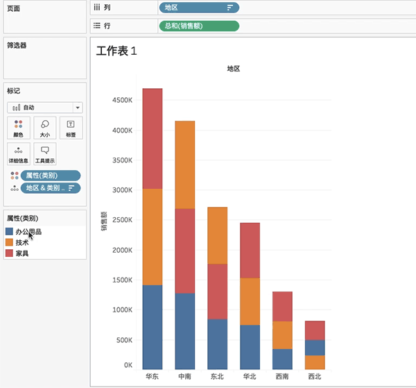
In the actual analysis scenario, when we complete the stacked column chart, Tableau usually defaults: stack each column in the same color order (as shown in the figure below).

However, this way of presentation sometimes affects our understanding of the sales volume of different categories in each column.
Therefore, there is a need for data powder: I want the stacked bars of each column to be sorted by sales, not by color.
How to achieve it? The method is not difficult, try merging fields!
In this issue of "Give a Chestnut", the Tableau trick that Ada wants to share with you is: use the merge field to adjust the stacked column chart sort.
To facilitate learning, we use the supermarket data source that comes with Tableau.
Specific steps are as follows:
1、Create a chart
Drag sales to the row, region to the column, and category to the color.

Change the category to attributes.

2、Create merge field
In the dimension pane, hold down the Ctrl key to select the category and region, and right-click to create a merge field.

Drag the created category area merge field to the detailed information.

Then, right-click the merged fields in the detailed information to sort them in descending order according to the sum of field sales.


Finally, do a descending order for the regions.

At this time, the three stacked columnar bars have the effect of "sorting in descending order of sales".

Tip: In practical applications, if the stacked column chart has many columns. We can also use the highlighting function to view the position of a specific category in each column at a glance.
Have you gotten the Tableau skills in this issue? Give it a try!