


Quickly Create Marginal Histograms with Tableau Extensions to Unlock Multi-Dimensional Data Insights
Visual structure of a Marginal Histogram
As shown below, a marginal histogram is a composite chart, typically consisting of two parts: a main plot + single-variable distribution plots along the top/bottom/left/right.

PART1 👉 Main Plot (Core Area)
Its purpose is to display the relationship or distribution between two variables (such as correlation, cross-performance, clustering, outliers, etc.). Common chart types used in the main plot include:
- Scatter plot: for two continuous numeric variables (e.g., Sales × Discount, Age × Income)
- Highlight table/heat map: for two categorical variables (e.g., Region × Category, Department × Grade)
- Heat map: also usable for bivariate density distributions
PART2 👉 Marginal Histograms (Edge Areas)
These display the univariate distribution characteristics of each variable (e.g., high/low distribution, outliers, dominant intervals).
- From a layout perspective, top or bottom marginal histograms correspond to the X-axis variable, while right or left marginal histograms correspond to the Y-axis variable.
- From a color perspective, scatter/dots/cells in the main plot are color-coded to distinguish different value ranges, positive vs. negative, or business categories, and marginal histograms can use the same colors to highlight extremes, frequent values, or outliers.
When placed on a dashboard with interactive filtering, both the main plot and marginal histograms can update together based on business fields (e.g., region, customer group, time period).
Traditional methods VS Extensions
Taking Tableau as an example: while users can manually build separate scatter plots and bar charts, then simulate a “main + distribution” layout by combining them in a dashboard, the process is often tedious—requiring repeated axis adjustments, alignment formatting, linked filtering, and binning. This is inefficient and prone to error.
Moreover, if you want categorical or measure-based marginal histograms, the steps get even more complex:
- You need to manually create bins, auxiliary axes, dual-axis synchronizations, with no guaranteed interaction.
- It gets harder to configure across multiple dimensions (e.g., Region × Category × Segment).
- Business users can’t easily reuse the setup, leaving analysts burdened with heavy maintenance.
The good news is: Tableau Exchange now offers this visualization as a Viz Extension. So you no longer need to manually configure axes or bins—you can quickly build such complex charts. 
In short, just add the MarginalHistogram visualization extension in Tableau’s “Marks” card, choose the main and marginal variables, and it will automatically generate:
01 Categorical Marginal Histogram
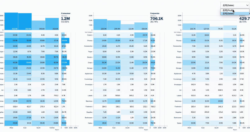
Categorical marginal histograms are useful for analyzing multi-dimensional discrete data (e.g., region, sub-category, customer segment) and visually comparing distributions and aggregations across dimensions.
For discrete dimensions like “Region × Product Subcategory × Customer Segment,” the Marginal Histogram extension will automatically recognize and generate categorical marginal histograms. As shown above, through positive/negative blocks and top marginal bars, you can intuitively compare profitability across different segments in regions and categories:
- Identify profitable/unprofitable categories and key markets at a glance
- Help sales/management teams focus on weak spots and optimize channel/product strategies
- Compare performance across Segments for differentiated operations

02 Numerical Marginal Histogram
Numerical marginal histograms combine scatter plots with histograms to reveal joint and individual distributions of continuous variables (e.g., Sales, Profit, Discount).
For continuous data like “Sales × Average Discount,” numerical marginal histograms plus scatter plots let you analyze customer structure, outliers, and overall business characteristics in one view:
- Quickly identify high-sales/high-discount risk or key customers
- Marginal histograms show that most customers cluster at low ranges, helping identify long-tail vs. core customer groups
- Use filters to flexibly explore distributions across regions or segments, enhancing refined operations

Example Demo: Superstore Profit Analysis
Next, we’ll use Tableau’s built-in Superstore dataset to demonstrate how to quickly create marginal histograms and use them for interactive analysis on a dashboard.
In the profit performance dashboard below, combining marginal histograms with maps and time-series line charts provides a holistic view of profit distribution across dimensions, helping discover profit structures, identify high/low performing regions, and monitor fluctuations for business optimization and strategy.

Specific steps:
01 Create a Categorical Marginal Histogram
In Tableau Desktop, connect to the Superstore dataset and create a new worksheet.
Then, in the “Marks” card, expand the mark type dropdown, click “Add Extension,” search for MarginalHistogram, and install it.

Next, create a numerical marginal histogram. In the “Data” pane, drag fields into the “Marks” card:
- Drag dimension “Segment” to the X-axis to show three customer segments.
- Drag date field “Order Date” to the Y-axis and change it to discrete weekdays, so the Y-axis shows days of the week instead of years.
- Drag measure “Profit” to Measure to calculate and color the profitability of each cell.

Now the categorical marginal histogram is ready. You can see:
- Each cell in the main plot reflects profit performance of the three segments across weekdays, with darker colors and higher values indicating higher profit.
- The top marginal histogram shows total profit by customer segment, enabling instant comparison of overall contributions.
- The right marginal histogram summarizes total profit by weekday, helping detect business peaks and troughs.
- The top-right KPI highlights total profit and percentage, emphasizing overall performance.
If you need to configure the visualization, click the format button in the “Marks” card. The MarginalHistogram extension supports the following settings:
👉 Field & Logic Settings (Calcs)
X/Y axis selection: categorical variables for dimensions, numerical for measures.
Measure/custom measures: directly define new measures with expressions in Calcs and add them to the view.
Supports point-and-click field selection and basic calculations for easy custom KPIs.

👉 Number Formatting & Units (Numbers)
Supports unit abbreviations (K, M), decimal places, currency symbols ($, ¥), and different formats (numeric/percentage) for each measure.

👉 Visual Formatting & Layout (Formats)
Control visibility of axes, gridlines, zero lines, axis titles for readability.
Adjust marginal histogram height, main plot spacing, facet spacing, and padding to fit report styles.
Flexibly set the number of facets per page for multi-dimensional comparisons.

👉 Color Logic (Color)
Configure colors for positive (profit) and negative (loss) values (e.g., blue/pink) for instant distinction.
Supports unified background, axis, and point colors, or custom brand colors.
Heatmap and scatterplot styles can be switched anytime.

👉 Scatter/Binning Settings (Scatter)
Set the number of bins for marginal histograms to analyze distributions at different granularities.
Control whether scatterplot labels (e.g., large customer names) are displayed and whether they can overlap.

02 Create a Profit Ratio Map
Create a new worksheet, double-click the “State/Province” field in the Data pane, and Tableau will auto-generate a symbol map.
Create a calculated field named “Profit Ratio” with the expression SUM([Profit])/SUM([Sales]) and drag it to the “Marks” card color shelf.
If needed, adjust legend colors and map background to remove unnecessary elements for a cleaner look.

03 Create a Category Profit Line Chart by Quarter
Create a new worksheet, drag Order Date to Columns, Profit to Rows, and Category to the “Marks” color shelf. Right-click the Order Date pill and convert it to continuous Quarters.

04 Build a Dashboard and Set Interactivity
Create a new dashboard, drag the three worksheets into the canvas, and adjust the layout. Then, for each worksheet, click the funnel icon in the toolbar to set it as a filter.
This way, clicking any mark in the views applies global filtering across the dashboard, allowing deeper exploration of Superstore profit performance across dimensions.