


 400 998 0226
 Tableau


 Tableau
 Minitab


 Alteryx


 Neo4j
Neo4j


 Talend


 IM
IM


 华为云
华为云 腾讯云
腾讯云 IT/安全
IT/安全


Lift a chestnut! Tableau Trise (134): Set the operation to view data details and accounting
Recently, the data is drilled under the data, we share the drilling and use of the data under the filter to achieve the data of the data of the tree map under the filter. So-learning data powder will soon master and integrate! Today's chestnuts, from Tableau users @ classmates
Submission. Although it is also a collection of operations to achieve data, this application scenario is more specific and practical. Thank @ sh classmates sharing for everyone
l The set value is greatly enhanced by the user's data interaction experience and view style, which can be used for filter, tag, as a dimension to add rows or columns, used in the calculation field;
l The set value gives the user to determine which values are concentrated, which helps improve the flexibility and interactive experience of analysis;
l Set values allow users to see what they have in the set, there is no need to filate or parameters, just simply click to implement.
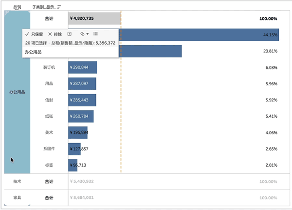
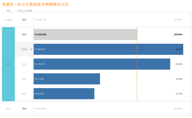
As shown in the figure below, in the bar chart, when you click the data having a large particle size, you can directly drill directly in the original view. This visual effect is being implemented by using collection actions and small codes.
How do you implement it in Tableau? Let's share the method.
The Tableau tricks we want to share with you this issue are: intended to view data details and accounting.
For the convenience of learning, chestnuts use Tableau to own the "example-supermarket" data source. After mastering the chestnut method, the data powder can try to use its own data.
Specific steps are as follows:
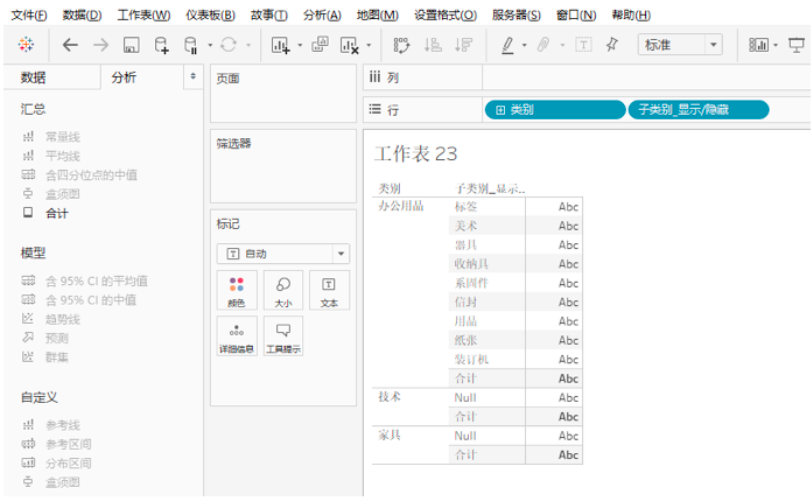
1. Open Tableau Desktop, connect "Example - Supermarket" data source, and create a new worksheet.
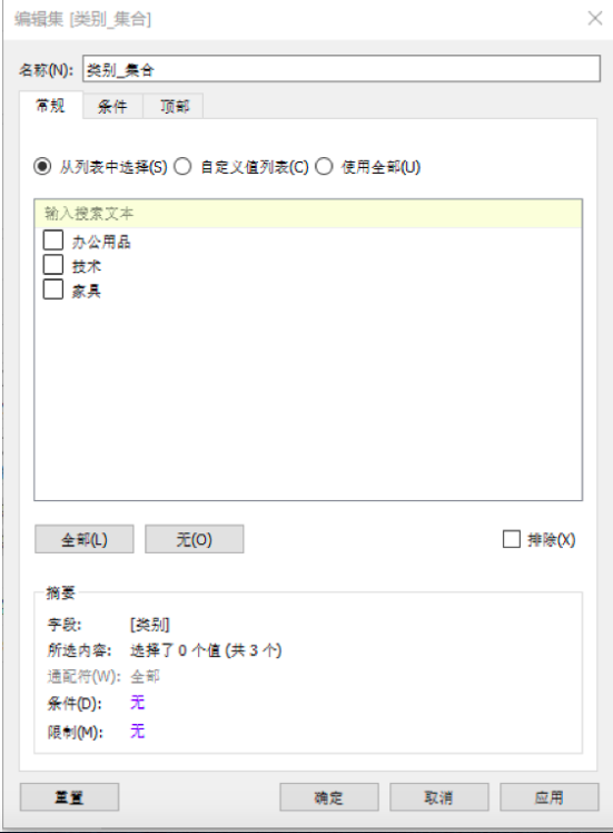
First, you need to create a set. In the "Data" pane, right click on the dimension "Category" and select "Create" - "Set" in the drop-down menu. In the "Edit Set" dialog box, the name is changed to: Category _ collection, and then click Confirm.
2, then, you need to create a calculation field.
Right-click on the "Data" pane, select "Create" - "Calculate Field" in the drop-down menu. Name the calculation field: subcategory _ display / hide, type functions:
IF [Category _ Collection] Then [Subcategory] END

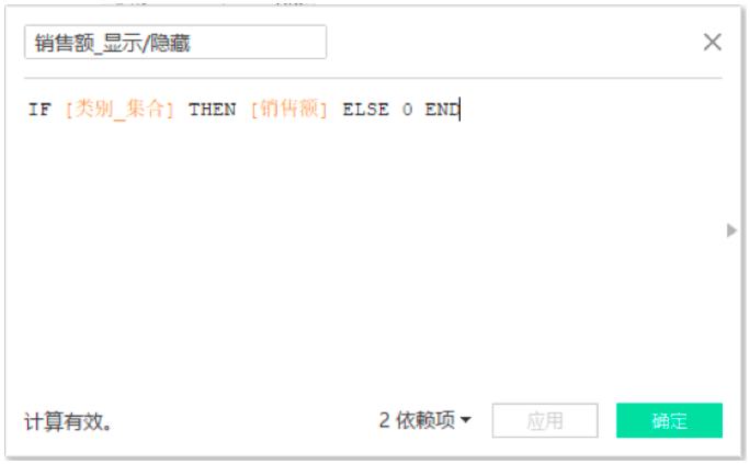
Repeat the above steps to create a calculation field: sales _ display / hide, type function:
IF [Category _ Collection] THEN [Sales] ELSE0 END
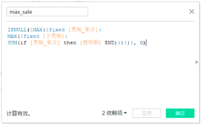
Repeat the above steps, create a calculation field: sales _ max, type function:
IFNULL ({Max ({Fixed [Category _ Collection]: max ({Fixed [Subtail]: Sum (IF [Category_Gerit) Then [Sales] End)}}}}, 0)
3, then create a view.
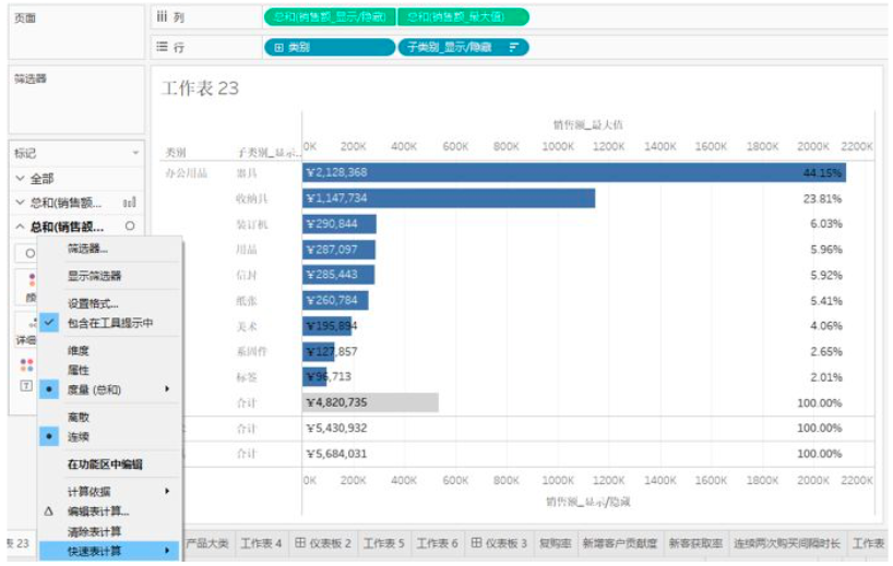
Drag and drop the dimension "category" and calculation field "subcategory _ display / hide", and select "Total" in the "Analysis" pane.
Then drag and drop the calculation field "sales _ display / hide" and "sales _ max" separately.
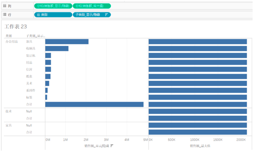
Right-click the horizontal axis title, select "Double axis", repeat the above steps, select "Synchronous axis".
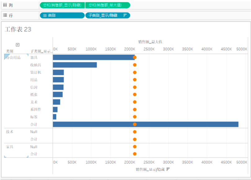
Drag and drop the calculation field "Sales _ Show / Hide" to "Tag" card, tag type selection: bar graph; in the Sales_ Maximum value tag card, the tag type is selected as: round, click "Size" is taled minimized, click "Color" to set its transparency to 0%.
Right click on "NULL" in the technical and furniture categories in the chart, select Hide.

4. Create a calculation field: subcategory _ color, used to distinguish a color block, type function:
IF attr ([Category _ Collection]) THEN
IF min ([subcategory _ display / hidden])! = Max ([subcategory _ display / hide]) THEN 'TOTAL'
ELSE ‘Not Total’ END
ELSE ‘Total’
END

At the same time, drag the "Mark" card "Mark Name" and drag and drop the calculation field "Subcategory _ Color" into the color of the "Mark" card, click "Color" to set it to white or light gray.

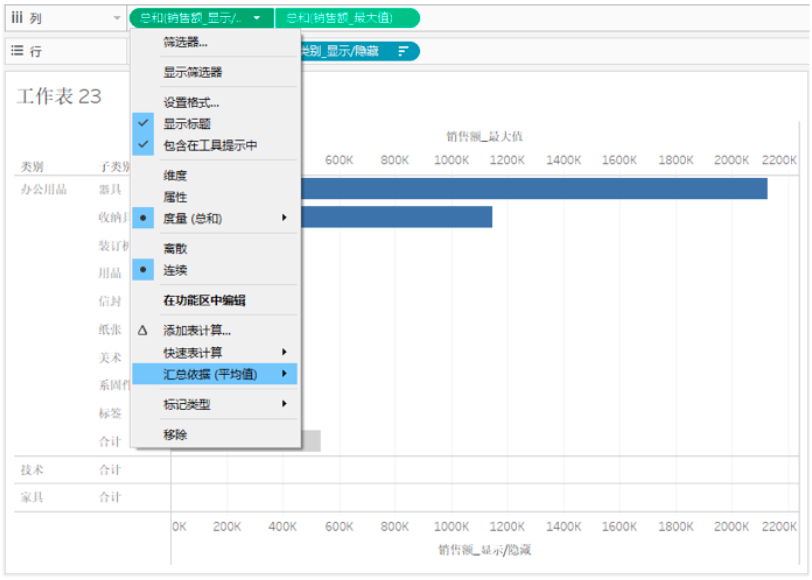
Click on the "Sales _ Show / Hide" capsule to the small triangle, in the drop-down menu, select "Summary Bas" - "Average".
Drag and drop the metric "Sales" to the label of the Sales_Trave / Hide "tag, display specific values in the view.

Click the "Sales _ Show / Hide" tag card, select the font and right.

Drag the metric "Sales" to the label of the Sales_Tigamental "tag, and right-click the tag card name" Sales _ max ", select" Quick Table Calculation "in the drop-down menu -" Total percentage ", Calculating the" subcategory _ display / hide "based on the basis.
5, next is a key step: set the set operation.
Click on the top menu bar "Worksheet" - "Operation", in the "Operation" dialog box that pops up, select Add Action - "Change Set Value".
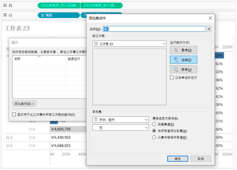
In the "Addset Action" dialog box that pops up, the target set selection: reserves the set value, the operation mode is generally selected: Select.

After clicking confirmation, return the view, click the Category Name, you can view the sales and proprietary situation of its subcategories.

6, because the summary set value is set to average, in the total number of total number, but the column represents the average value of light gray. If you need to further enhance the visualization effect, you can add a reference line, right-click the coordinate axis, select Add Reference Line.

At the same time, some format settings are performed on the view:
l Click the "Sales" capsule on both tag cards, select "Set Format", set the font size and bold.

l At the same time, click "Analyze" at the top menu bar, select "Total", set the total count at the top.
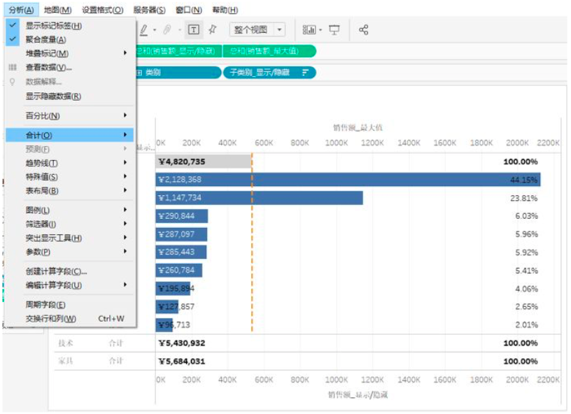
l Finally, right-click the coordinate axis and check "Do not display the title".
This issue of Tableau skills, have you get? Try it quickly!