


 400 998 0226
 Tableau


 Tableau
 Minitab


 Alteryx


 Neo4j
Neo4j


 Talend


 IM
IM


 华为云
华为云 腾讯云
腾讯云 IT/安全
IT/安全


Lift a chestnut! Tableau Tips (123): Switch View Chart with TABS Tab
Tab Tabs is a very common feature in the web. Tabs
The tab is placed in a certain layout block in a certain layout block, and only one of the overlapping content zones is visible. The user clicks on the menu item to switch to the corresponding content. For each developer, the layout is limited, and the information transmitted is unlimited.
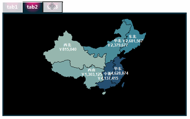
Recently, Tableau users learn to switch different charts in the same view: Can I achieve the chart switching view in TABS tabs in TABLEAU?
This is achievable. In some real analysis scenarios, we have implemented the following tab switching effect:
How do you implement it? Let's share the way!
The Tableau trick we want to share with you this issue is: Switch to the TABS tab to switch the chart.
For the convenience of learning, chestnuts use Tableau to own the "example-supermarket" data source. After mastering the chestnut method, the data powder can try to use other data sources.
Specific steps are as follows:
1. Create a worksheet for switching
Open Tableau Desktop, connect "Example - Supermarket" data source, create a new worksheet. First, you need to create three worksheets for switching.
Tips: This step worksheet is only used to switch rendering, and data powder can be created on demand and does not affect the chestnut effect.
➤ Worksheet: Tab1
Drag and drop the dimension "Category" to the column, drag and drop the metric "Sales" into the color of the Row and "Mark" card, and the workgroup is named: tab1.
➤ Worksheet: Tab2
Right click on the Rise "Region", select: Geographic Role - Create Basis - Province / Autonomous Region. Then, double-click the Geographical Role "Region", then drag and drop the metric "Sales" into the color of the "Mark" card;
Drag and drop the dimension "region" and metrics "Sales" to the label of the "Mark" card; rename the work surface: Tab2.
➤ Worksheet: Tab3
Drag and drop the dimension "region" to the line, then double-click "Profit", "Sales" and "Profit Rate"; click "Color" of the tag card, set the color to the color required (sample color: # 00fff) ;
In the filter card, right-click "Metrical Name" capsule, select: Sort by: Sort, in the pop-up dialog box, check "Descending"; the working surface is named: Tab3.
2. Create a calculation field
Next, three calculation fields are required to create three tabs for selecting switching.
Click the "Data" window to the upper right corner ▼ symbols, and the drop-down menu is selected: Create a calculation field. Create three fields: Tab1, Tab2, and Tab3, type functions: "tab1", "tab2", "tab3".

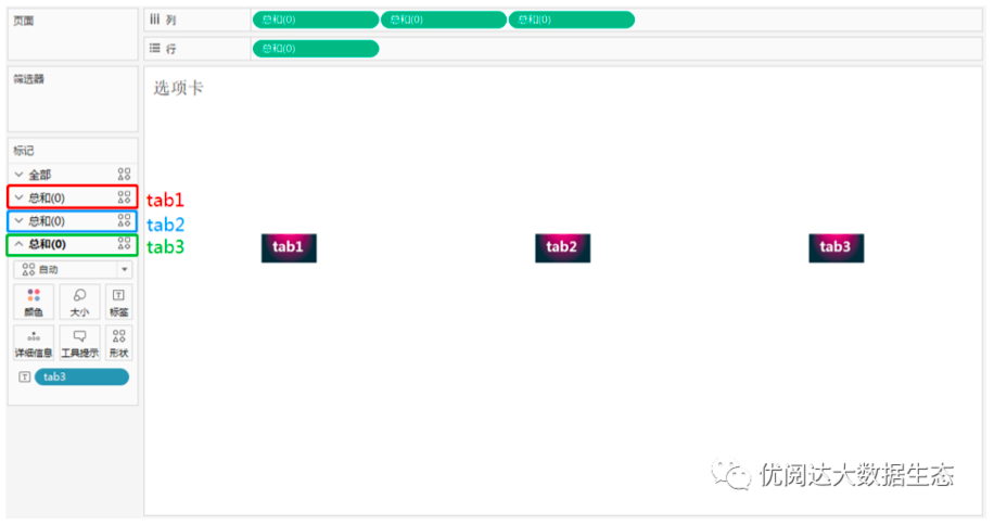
3, create tab worksheet
New worksheets and start creating a worksheet: tab.
Double click on the lines and columns, enter: 0 in the blank capsule: 0. You can add a "0" as a locator on the line, and three "0" is added as placeholders. Remove all the default properties of the worksheet (grid line, zero line, axial scale);
Drag and drop the calculation field "Tab1", "Tab2", and "Tab3" that have just been created to "Tab1", "Tab2" and "Tab3" "Tag" cards; click three "tag" cards, respectively. "Shape", select the desired label shape.
Tips: The example uses a custom shape (click Lear: how to insert custom.
4, create dashboard
New dashboard, from the "Object" pane from the left, first drag and drop a floating vertical container to the right side view, then drag and drop the two tiled horizontal containers after the size of the container is adjusted, As shown in the container 1 and the container 2) into the container. At this time, the two-tiled horizontal container that is dragged into the upper and lower positions can be confirmed by the mouse point.
Drag the Worksheet "tab" to the above container (container 1), drag and drop the worksheet "Tab1", "Tab2", and "Tab3" to the following container (container 2). Hide all worksheet titles and set the view size of each worksheet to: The entire view. At this point, the three worksheets in the container are arranged from left to right, and the chart may not be fully displayed, it is normal.
From the left "Object" pane, drag and drop a tiling blank to the upper container (container 1), place it on the right side of the worksheet "tab". Then, adjust the worksheet "tab" and blank object size, the worksheet "tab" is left aligned.

5, add action
Finally, through the operation setting of the dashboard, implement the effect of switching the view worksheet by clicking the tab. Click the Top Menu Bar "Dashboard", select: Operation in the drop-down menu, in the "Operation" dialog box, select: Add actions - Filter.
In the Plus Add Filter Actions dialog box, the filter name is set to "Tab1", "Tab2", and "Tab3". Source worksheets are selected as: tab, target worksheets are selected as: Tab1, Tab2, and Tab3.
The mode is selected as: selection, and check "Run only when only single selection"; clearing the selected content will be set to: exclude all values; the target filter is set to: selected fields, click the bottom "Add Filter ", source target fields separately:" Tab1 "," Tab2 "and" Tab3 ".

In this way, the visual effect of switching the chart with the TABS tab switch is completed, and the three tabs will be clicked, and the corresponding chart will be presented below.
This issue of Tableau skills, have you get? Try it quickly!