


Use the new Tableau dynamic color range to achieve more granular visual analysis
In visual analysis, outliers can obscure subtle differences in data.
Imagine analyzing sales performance across thousands of regions—if there are a few extremely high or low outliers in the data, those values, while noteworthy, can distort the entire color scale, making it difficult to distinguish nuanced differences between the majority of data points.
Ultimately, the entire map might end up in a single hue—or reduced to black and white. The truly important “middle ground,” where the most valuable insights often lie, gets buried.
Previously, Tableau only offered two modes for setting color ranges (palettes/scales): “Fixed” and “Automatic.” While sufficient in basic scenarios, they had clear limitations:
- Users with view-only access couldn’t adjust the color range, limiting their ability to explore and analyze data on their own.
- Automatic mode adjusted color ranges based only on data in the current view, meaning users couldn’t see the relationship between filtered-out and remaining data.
To address these issues, Tableau 2025.2 introduced “Dynamic Color Ranges,” enabling analysts to more effectively handle outliers and helping dashboard users better understand the data. This allows you to show the full dataset while diving deeper into the most meaningful insights. 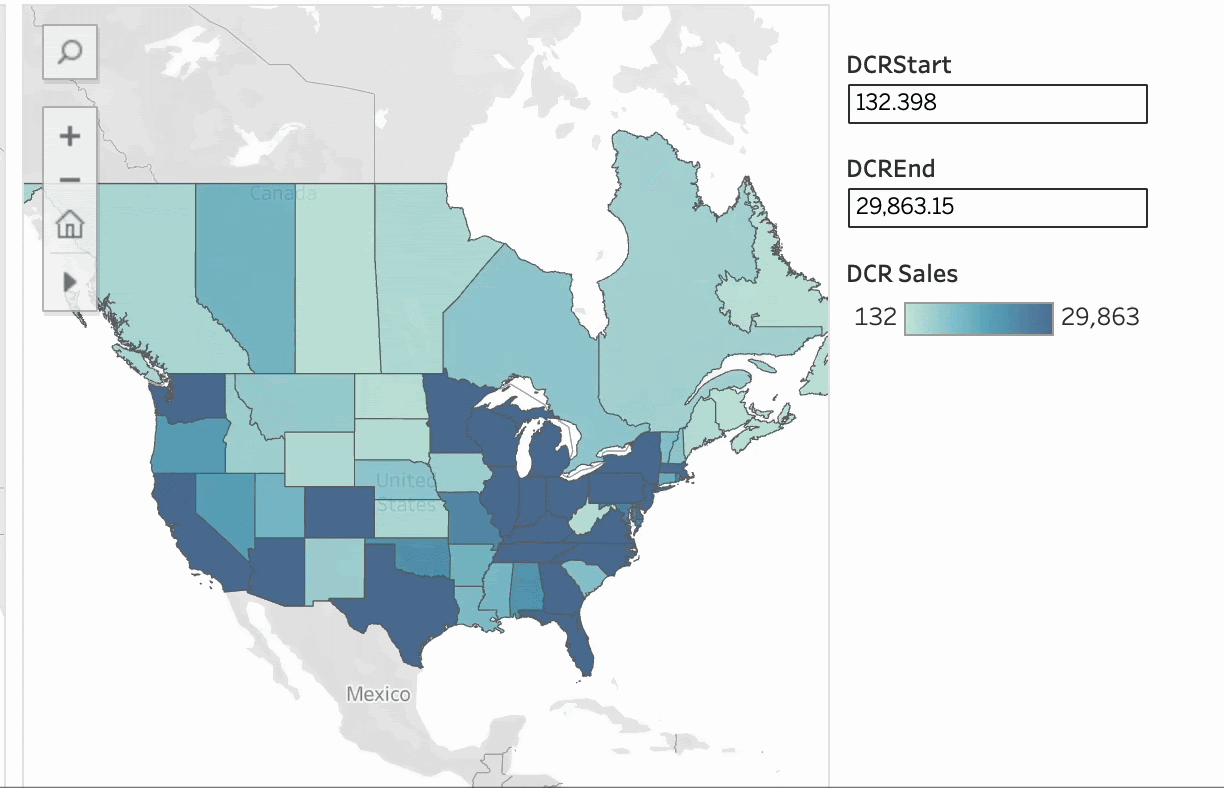
Dynamic Color Ranges in Tableau
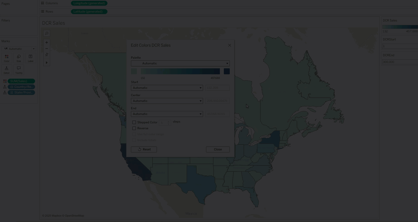
In Tableau 2025.2, the Quantitative Color Palette dialog received a major upgrade. In addition to a new interface, a powerful new capability was integrated into the core of data coloring—making the existing experience smoother, smarter, and more flexible than ever.
The key innovation: color range values (start, end, or even center) can now be dynamically linked to parameter values. This means that the color legend’s scale is no longer a fixed number, but can be controlled by any parameter set within Tableau.
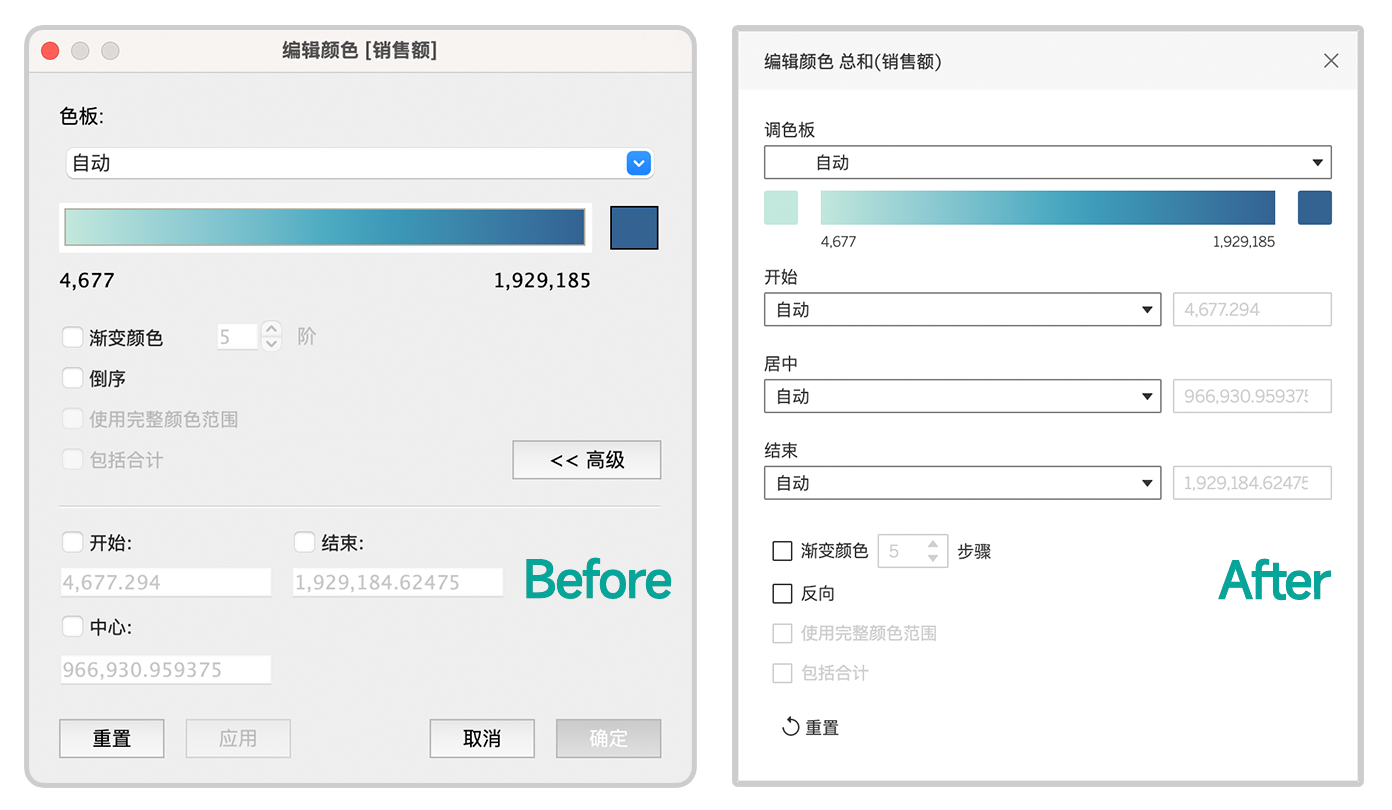
This gives color ranges real intelligence and interactivity—not only responding in real-time to user inputs but also automatically adapting to underlying data updates. Such flexibility ensures that your visualizations always highlight the most critical, impactful insights.
This highly anticipated enhancement continues Tableau’s vision of using parameter interactivity to create dynamic axes, offering users greater control and deeper analytical capability. What was once a static color legend is now a dynamic tool to illuminate the value of your data.
Three Ways to Use Dynamic Color Ranges
As mentioned above, dynamic color ranges fundamentally change how users interact with data visualizations. By linking color range values to parameters, not only can previously mentioned challenges be solved, but entirely new possibilities are unlocked through Tableau’s core feature—parameters.
01 Enable Parameter Controls
The simplest way to use this feature is to expose the parameter control. This allows users—even without edit permissions—to manually adjust the color range, removing dependency on predefined color scales.
By changing the range values in real-time according to their needs, users can independently explore data—for example, posing “what if” scenarios and discovering insights from different angles.
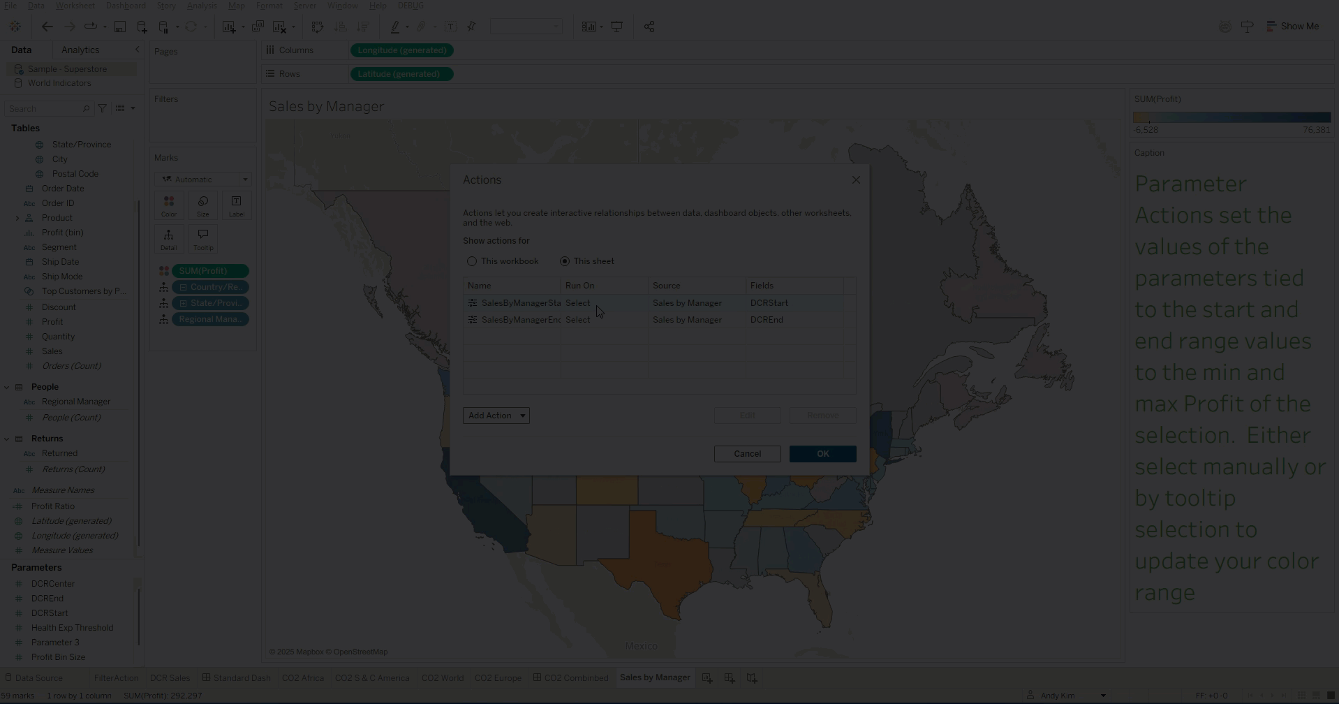
02 Combine with Parameter Actions for Interactive Exploration
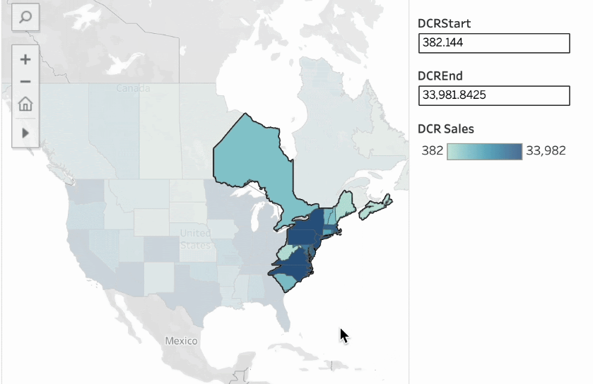
The true power of dynamic color ranges lies in combining them with parameter actions to create a more advanced interactive experience. By selecting data or hovering over a mark, users can dynamically adjust the color range and immediately see related data updates. As shown below, users can manually select or use tooltips to interactively refresh color scales, making analysis more intuitive.
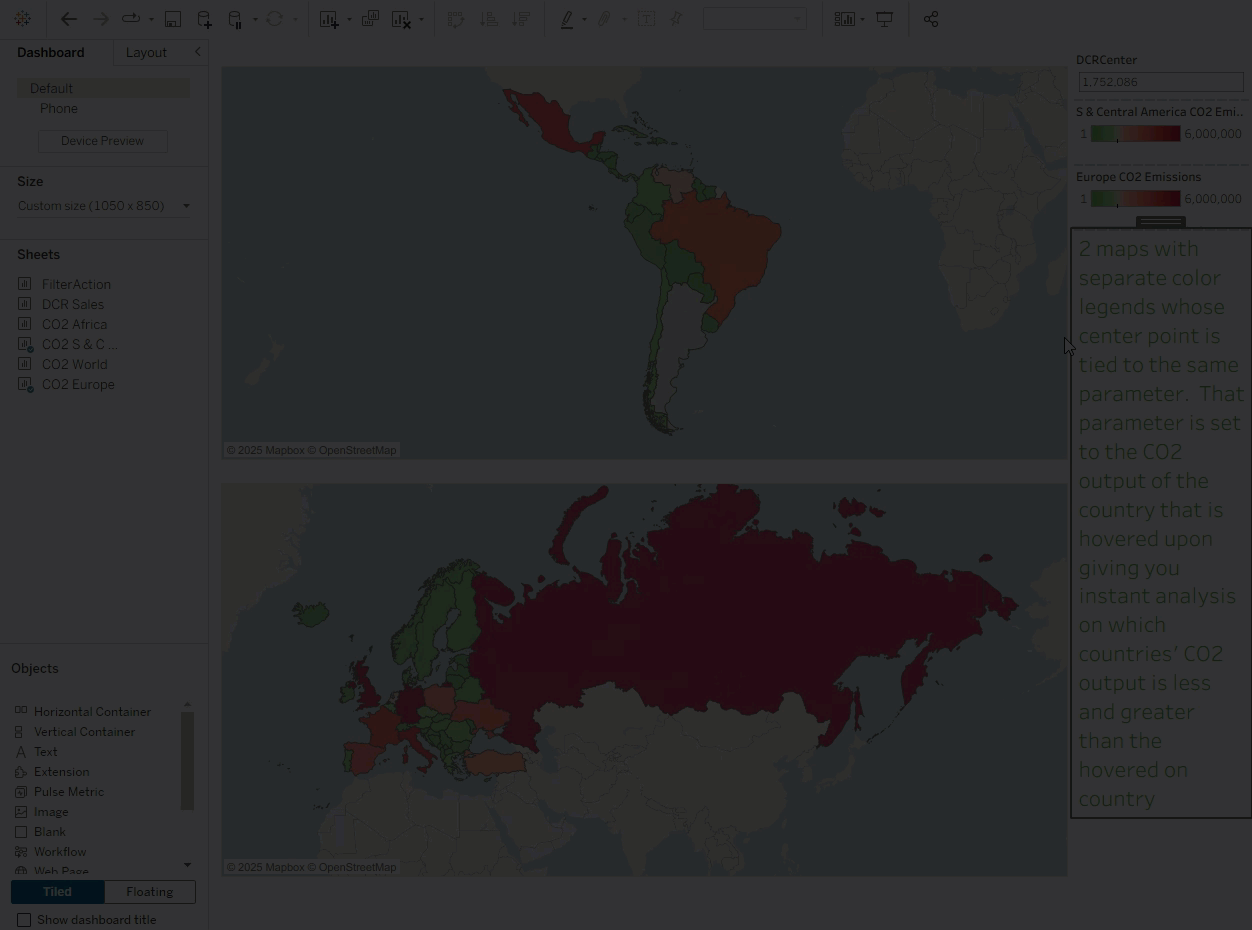
03 Synchronize Color Range Values Across Multiple Views
For analysts, maintaining consistent color ranges across multiple related visualizations in a dashboard has always been a challenge.
Dynamic color ranges solve this effortlessly. Simply apply the same parameter to multiple color legends, and the color ranges across views will stay synchronized. This enhances analytical consistency, clarifies visual comparisons, and reduces cognitive load for users—ensuring consistent visual styling.
As shown below, hovering over a country can instantly sync its effect across all views linked by that parameter.
Use Cases for Dynamic Color Ranges
As a foundational capability, dynamic color ranges are like building blocks that empower analysts to create more advanced analytics.
As described above, when paired with other interactive features, dynamic color ranges offer users a new way to explore data and unlock real-time insights. Here are three innovative use cases:
- 👉 Outlier Filtering: You can set range aggregation to the first or third quartile (instead of min/max), automatically ignoring outliers that distort coloring.
- 👉 Multi-Dimensional Tooltips: Add more fields to your views so tooltip-driven selections support multi-dimensional filtering.
- 👉 Dynamic Parameter Linking: Configure parameters to auto-refresh with data updates for truly intelligent color range adjustments.
Clearer visual analysis means more people can easily access insights. When using “Dynamic Color Ranges” to highlight data details, consider how these dynamic controls can also improve dashboard usability and accessibility.
Flexible color scaling not only meets different user preferences but also ensures key data contrasts remain visible—even for users with different assistive tools or color modes. This inclusive design ensures your analytical outcomes can be understood and used by a broader audience.