


The winning entry of TC25 Iron Viz is out, exploring wildlife strikes and aviation flight safety!

Over the past 15 years, Iron Viz has been a highly anticipated event for both on-site attendees at the annual TC Conference and global online audiences. In this data visualization showdown, three contestants must build a complete dashboard within 20 minutes and compete for the championship in a subsequent three-minute presentation.
This year, the competition data was provided by the U.S. Federal Aviation Administration (FAA), focusing on “Wildlife Strikes on Aircraft in the U.S.,” aiming to enhance aviation safety and reduce harm to wildlife.
Additionally, a judging panel composed of the 2024 champion, the Executive Director of the Data Visualization Society, and Tableau’s Chief Solutions Engineer evaluated the entries based on three key dimensions: design, analysis, and storytelling.

After fierce competition, Bo McCready claimed this year’s Iron Viz crown with a concise yet powerful submission! Meanwhile, Ryan Soares, voted champion by the global community, will be honored at the Vizzies Awards.
You must be brimming with curiosity—let’s dive into these three visualizations and explore the unique data stories they tell!
01 The Perilous Journey of Migratory Birds
The judges praised this Viz for its “perfect fusion of technical skill, unique perspective, and precise storytelling.” Through creative use of parameters, calculations, and interactive features, Ryan Soares crafted a visualization that truly takes flight.

Ryan’s work, set against a deep night-blue backdrop, unfolds across four sections, offering a step-by-step interactive experience that simulates the immersive journey of migratory birds.
Trends: Historical Bird Strike Reports
The dashboard’s homepage features an area chart showing total bird strikes from 1990–2024, highlighting the sharp drop during the 2020 pandemic and the peak in 2024. The trend—from 1,743 incidents soaring to 14,713—visually conveys the accumulating danger.

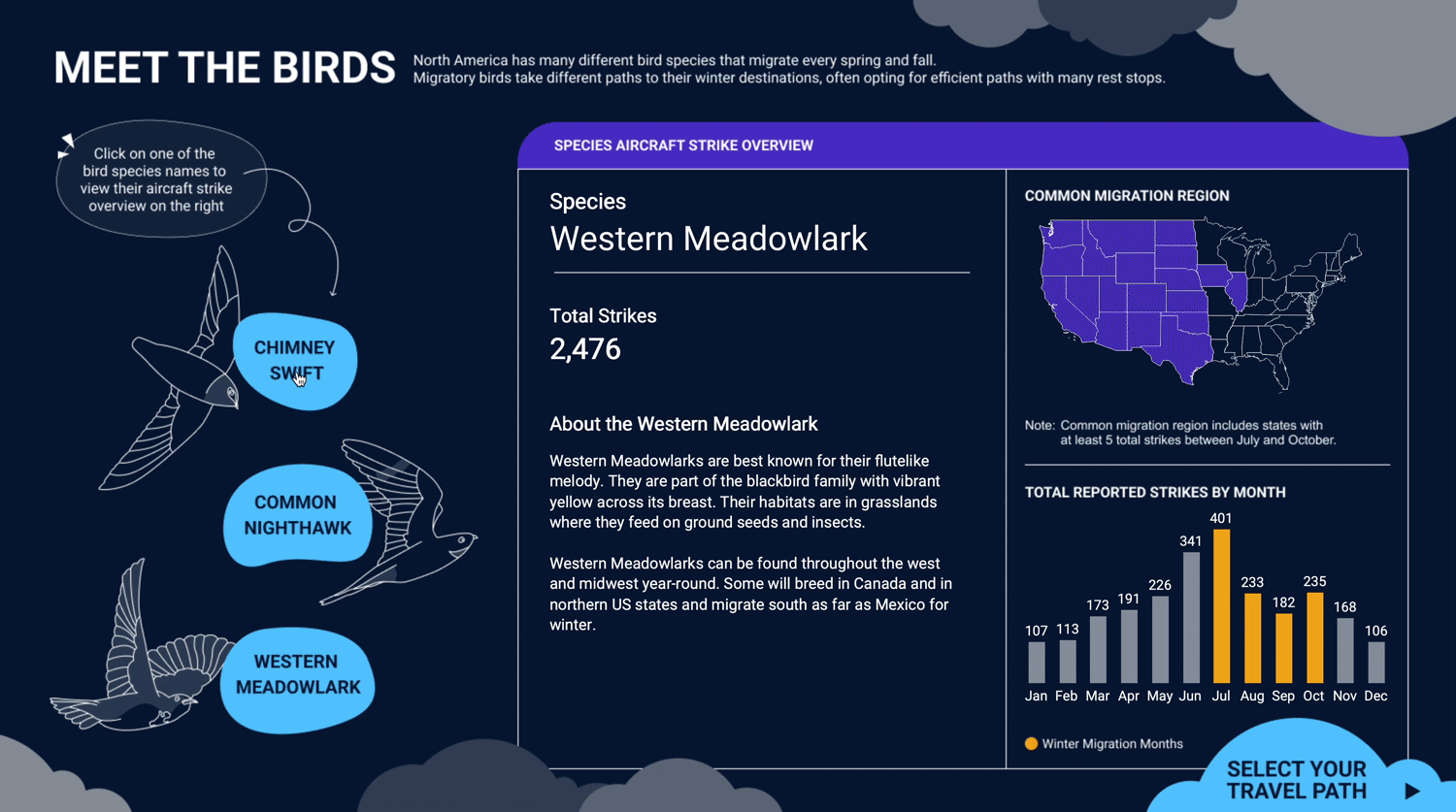
Species Exploration: A Bird’s-Eye View
On the second page, hand-drawn silhouettes of three migratory birds—Chimney Swift, Western Meadowlark, and Common Nighthawk—are paired with clickable blue bubbles. Users can select a species and view its total strikes, common migration zones, and monthly strike frequency.

Ryan delves into species differences, seasonal fluctuations, and geographic distribution:
A heatmap in purple highlights high-risk migration states (annotated as “states with at least 5 reported strikes”).
A monthly bar chart contrasts winter migration months (orange) with others (gray), revealing higher collision risks during migration.
Route Decision: Interactive Airport Map
Ryan then upgrades to an interactive map, simulating flight path selection to demonstrate how airport distribution affects safety. Purple zones mark common migration areas, while white dots represent airports.

Using Tableau’s parameter actions and spatial calculations, users can “choose a travel route” by clicking a start (green ★) and end (blue ×) point. The right panel then lists airports along the route.
This design not only immerses users in the birds’ perilous journey but also underscores the need for safer flight paths.
Risk Assessment: Route & Strike Reports
The final visualization aggregates mileage, total strikes, airports en route, and monthly risks, offering a comprehensive view of “safe flight windows”:
Key metrics at the top summarize migration distance and risk scale.

A translucent arc connects start and end points, with airports highlighted along the path.
Vertical bubble charts rank airports by strike frequency (bubble size/color).
A bar chart breaks down monthly strike distribution, helping users identify the safest travel times.
Overall, Ryan’s use of parameters and smooth animations creates a technically impressive yet aesthetically pleasing migration simulation. His analysis balances macro trends with species and spatial insights, while the narrative structure turns cold data into an emotional journey—inviting viewers to empathize with the birds’ plight and advocate for safer skies.
This blend of design, analysis, and storytelling made Ryan’s Viz the fan favorite.
02 Wildlife Strikes
The judges commended Kathryn McCrindle’s innovative approach to revealing trends in wildlife strikes, highlighting the most frequently damaged aircraft parts, severity levels, and common species involved. Her use of bold visuals, dynamic effects, and a custom “damage cockpit” built with concentric rings clearly presents collision risks.
But how do humans mitigate these risks? Kathryn takes it further with a “danger zone” map, using a spotlight effect to show how airport surroundings influence strike risks. Her data-driven methodology and elegant design create a dashboard rich with insights.
Overview: Trends & High-Risk Species
Against a gray-blue backdrop, bold headlines and wing-shaped silhouettes immediately draw attention. The left panel notes that 96% of wildlife strikes from 1990–2023 involved birds, questioning whether rising reports reflect increased risk or better reporting.
An orange line chart shows strikes surging from thousands to nearly 20,000, with a brief pandemic dip. A bar chart lists the most collision-prone birds (e.g., Mourning Dove, Killdeer, Barn Swallow), with clickable bars for cross-filtering.
Damage Analysis: The “Runway Ring”

Kathryn’s second dashboard uses concentric rings to dissect damage across 11 aircraft parts:
Inner ring (pink): Proportion of total strikes per part.
Middle ring (yellow): Proportion causing damage.
Outer ring (red): Proportion causing severe damage.
For example, in 2023:
Engines had 15 strikes, with high severe-damage risk.
Windshields had 5 strikes, mostly minor.
Lights rarely suffered major damage.

Trend charts alongside reveal that while total strikes rose, severe damage rates declined post-2016, suggesting mitigation measures worked.
Danger Zones: Airport Surroundings
The final view plots U.S. airports as blue bubbles (size = strikes within 5 miles). Kathryn notes that 94% of strikes occur during takeoff/landing. Clicking an airport reveals local land use (wetlands, farmland, etc.), linking environment to risk—a call to action for targeted safety measures.
03 Two Eras of Safety
Though less visually ornate, Bo McCready’s minimalist style—inspired by late Tableau visionary Kelly Martin—won the judges over.
Defining Two Eras
Bo’s opening slide splits 1990–2009 and 2010–2023 into “pre- and post-reform” eras, using warm orange and bright yellow in a bar chart to show annual strikes. A quote from FAA biologist John Weller underscores the impact of the 2009 “Miracle on the Hudson” incident.
Radial charts at the bottom display monthly strike trends for five major airports, color-coded by era.
Matrix Drilldown: Yearly & Monthly Strikes
A matrix layout plots strikes by year (columns) and month (rows). Key takeaways:
White bars show rising annual totals, with 2009 as a turning point.
Bubble pies (size = strikes) highlight severe damage (red edges).
Monthly totals (right) reveal seasonal peaks.
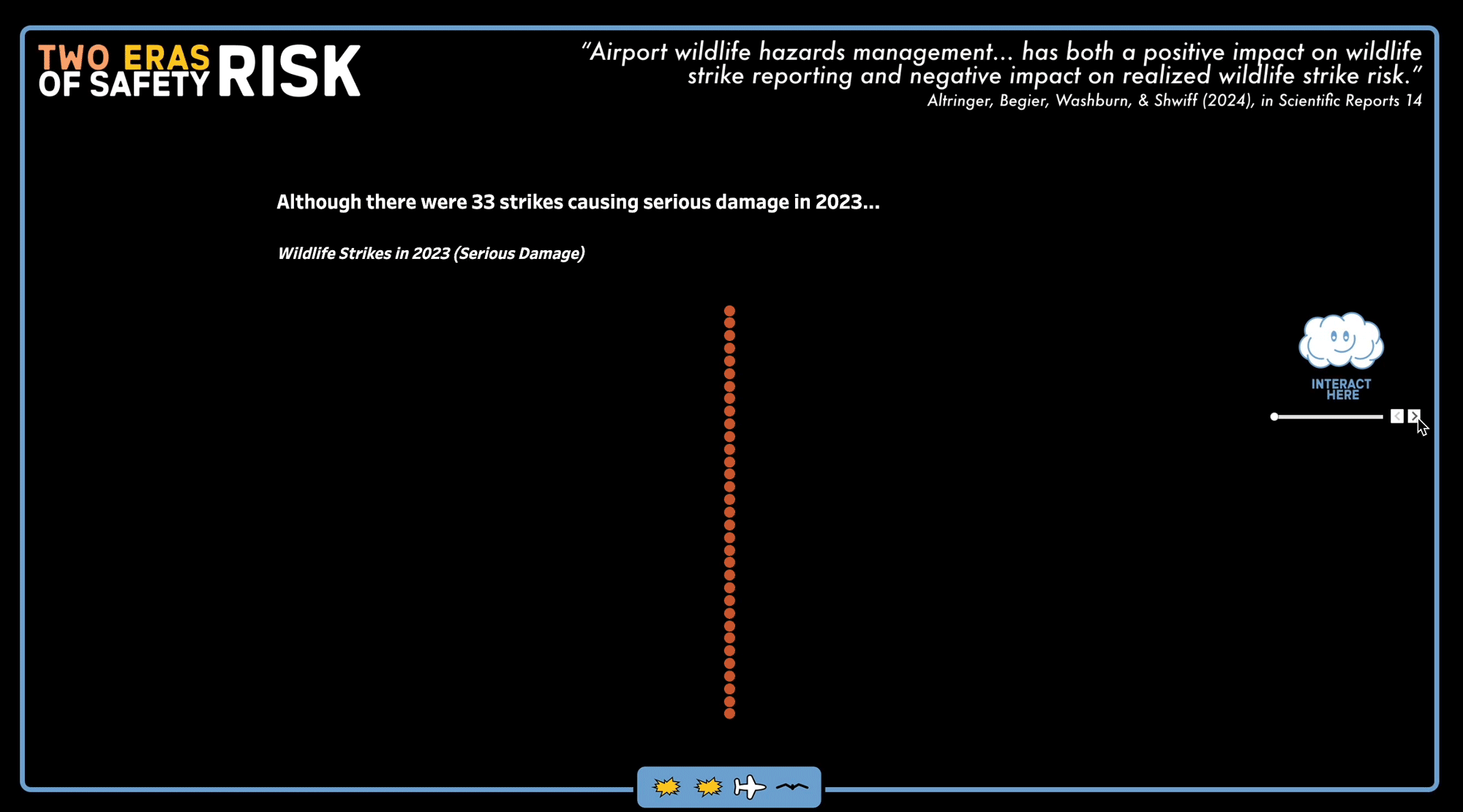
Uncovering Insights: Is Risk Decreasing?
Bo guides viewers through layered insights:
33 orange dots represent 2023’s severe strikes—a focal point.
Zooming out, 16,000+ white dots emphasize that severe cases are rare.

Focusing on San Diego Airport shows zero severe strikes in 2023.
A timeline confirms that while total strikes rose post-2009, severe incidents remained stable.
The message: “Even as reports increase, your risk remains very, very low.”
Tribute to Kelly Martin
Bo closes with Kelly’s mantra: “Beauty is meaningful design… balancing best practices, creativity, simplicity, clarity, and efficiency.” A “cloud” button links to Kelly’s original work, inviting further exploration.
Bo’s direct, layered storytelling—rooted in simplicity—secured his victory.