


Enterprise Data Empowerment | Template Showcase: Telecom Customer Churn Dashboard
In the era of big data, lean data management has become a key driver for enterprises to enhance their core competitiveness. Across various industries, how can businesses strategically leverage data, build analytical platforms, and improve management and operational capabilities?
The DCC Data Creation Academy’s series, “Enterprise Data Empowerment: Application Template Sharing”, starts from real business scenarios, takes a data-driven perspective to analyze problems, and uses data to speak within business contexts—supporting scientific decision-making and helping companies reduce costs and improve efficiency.
Today, we are pleased to share a Tableau application analysis template: the Telecom Customer Churn Dashboard created by Iaroslava Mizai. This dashboard enables businesses to gain a comprehensive understanding of customer behavior trends across regions, service plans, and feedback, helping drive more precise and effective retention strategies.
Dashboard
This marketing activity dashboard features one main section: Regional Overview. A year selector is located at the top right corner of the dashboard, allowing users to easily switch between different years for comparative analysis. Adjacent to it are key metric definitions to help users quickly grasp the data context:
- Negative Growth %: Indicates a decrease in churn rate—fewer customers have left, showing improved retention.
- Positive Growth %: Indicates an increase in churn rate—more customers have left, reflecting poor retention performance.
- Satisfaction: Represents the average customer satisfaction score.
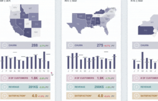
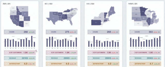
1. Regional Overview
This dashboard clearly reveals trends and year-over-year changes across major regions in terms of churn rate, customer volume, revenue performance, and customer satisfaction. It also breaks down churn rates and top churn drivers by service plan in each region.
👉 First, let’s look at the top section of the dashboard: The entire U.S. is divided into four major regions—West, Southwest, Northeast, and Midwest. Each region is presented with a yearly summary of key business metrics, including:
- Regional Map: Displays the states within each region and marks customer-related indicators along with their year-over-year change rates.
- Customer Churn Volume: Shown in blue, includes the total annual churn, YoY change %, and a monthly trend bar chart to identify peak churn periods.
- Total Customers: Shown in red, presents the total customer count, YoY trend, and monthly data shifts.
- Revenue: Highlighted in green, displays total annual revenue and YoY changes along with monthly trends.
- Customer Satisfaction: Shown in brown, reflects the annual average satisfaction score and its YoY shift, supported by monthly trend visuals.
These four key metrics are color-coded for intuitive recognition and quick comparison.
A clever interactive feature: Clicking the “+” icon before a metric expands the corresponding bar chart while collapsing others, maintaining a clean interface. The regional map and service plan-specific charts update interactively to help users better understand customer behavior and business performance across multiple dimensions.
👉 Next, let’s examine the Service Plan Analysis module in the middle section. It categorizes data into three types of plans: “Standard,” “Basic,” and “Premium.” It compares four core indicators—churn volume, total customers, revenue, and customer satisfaction—across different product lines, helping businesses understand performance and customer feedback for each plan type.

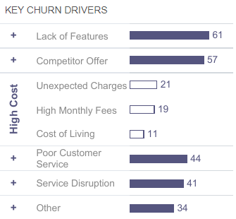
👉 Finally, we have the Customer Churn Driver Chart at the bottom. Each region lists the top six reasons contributing to churn, including: high cost, service interruptions, poor customer service, missing features, competitor offers, and others. These insights guide targeted improvements—such as technical upgrades, customer service training, or product enhancements.
Interestingly, users can click the “+” icon next to any driver to expand and view its sub-reasons. For example, clicking “High Cost” may reveal details like monthly charges, rising living costs, or unexpected fees—uncovering the root causes behind churn.
Conclusion
Thanks to Tableau’s agility, usability, and visual analytics capabilities, data can be presented in a clearer, more efficient, and accessible manner—powerfully supporting the development of a data-driven culture and injecting new momentum into enterprise growth.