


Data Analytics Dashboard | 5 Essential Skills for Creating Clear Dashboards!
Summary: 5 Core Principles for Building Professional Data Dashboards In today’s data-driven decision-making environment, clear and effective dashboards serve as critical tools for communicating insights. This article systematically presents five practical techniques for dashboard creation. First, establish solid foundations by starting with basic charts like bar and line graphs while employing fixed layouts for precise element control. Second, adhere to minimalist principles by limiting color schemes, standardizing sans-serif fonts, and eliminating redundant elements to enhance readability. Third, select optimal chart types based on specific analytical purposes like comparison, trend analysis, or distribution, avoiding potentially misleading visualizations. Fourth, apply scientific white space techniques through layered padding settings to create visual hierarchy and focus points. Finally, skillfully implement Gestalt principles of proximity and similarity to guide user attention through element grouping and unified design. Together, these principles reveal that the essence of dashboard design lies in information simplification – effective data visualization prioritizes restrained, precise design over flashy techniques to transform complex data into actionable insights. Whether for beginners or experienced analysts, mastering these five core techniques enables the creation of dashboards that balance professionalism with practicality, ultimately unlocking data’s full decision-making potential. By making data stories clearer and more compelling, these methods facilitate seamless transition from data to action, providing robust support for business decisions.
Here are 5 key secrets to help you easily create professional dashboards.
A good dashboard is like a clear and concise report that quickly transforms complex data into understandable information. If a dashboard is disorganized, it becomes like scattered sand, failing to provide users with valuable insights. Clearly, well-structured content is the soul of a dashboard, helping us quickly uncover the truth behind the data.

So how do you create clear visualizations? Next, we’ll reveal 5 secrets to help you easily build professional dashboards.
Master the Fundamentals
Before creating complex dashboards, it’s crucial to build a solid foundation. Instead of chasing flashy features from the start, first master the most basic chart types.
Learn Basic Charts
To create effective data visualizations, start with the basics. Bar charts and line charts are the foundation of data visualization. When designing these charts, keep them simple and clear, avoiding unnecessary complexity.
Create Simple Dashboards
Begin by creating clean, easy-to-read dashboards. They can be very basic—just a few bar charts without complex KPIs or fancy visual elements. The focus should be on clear layout for quick comprehension. While such dashboards may not look flashy, they communicate information very intuitively.
Use Fixed Layouts
If you’re using Tableau, start with fixed layouts. Fixed layouts offer better control, allowing precise placement of each element. Once you’ve gained deeper understanding of layouts, you can then explore responsive dashboards for different screen sizes.
Keep It Simple
Use Color Thoughtfully
Start with gray and maintain consistent color schemes across charts. Gray offers a rich range of tones—find one you like. This helps you better determine when color is truly needed.
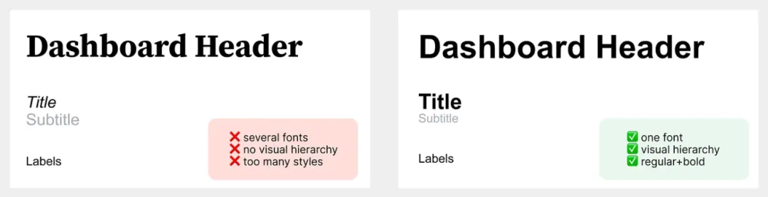
Standardize Fonts
Choose one sans-serif font and vary only its weight. Serif fonts work better for long texts but add visual clutter in charts. Sans-serif fonts like Arial, Roboto, and Verdana are cleaner and clearer. Google Fonts also provides excellent options.
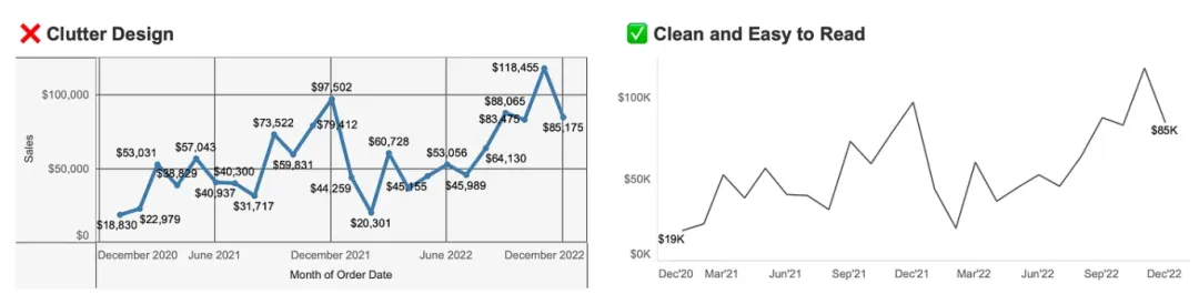
Simplify Chart Elements
Remove unnecessary elements like borders, gridlines, excessive labels, and backgrounds. If gridlines are needed, use light gray. Tableau’s default formatting is usually sufficient—avoid over-customization.
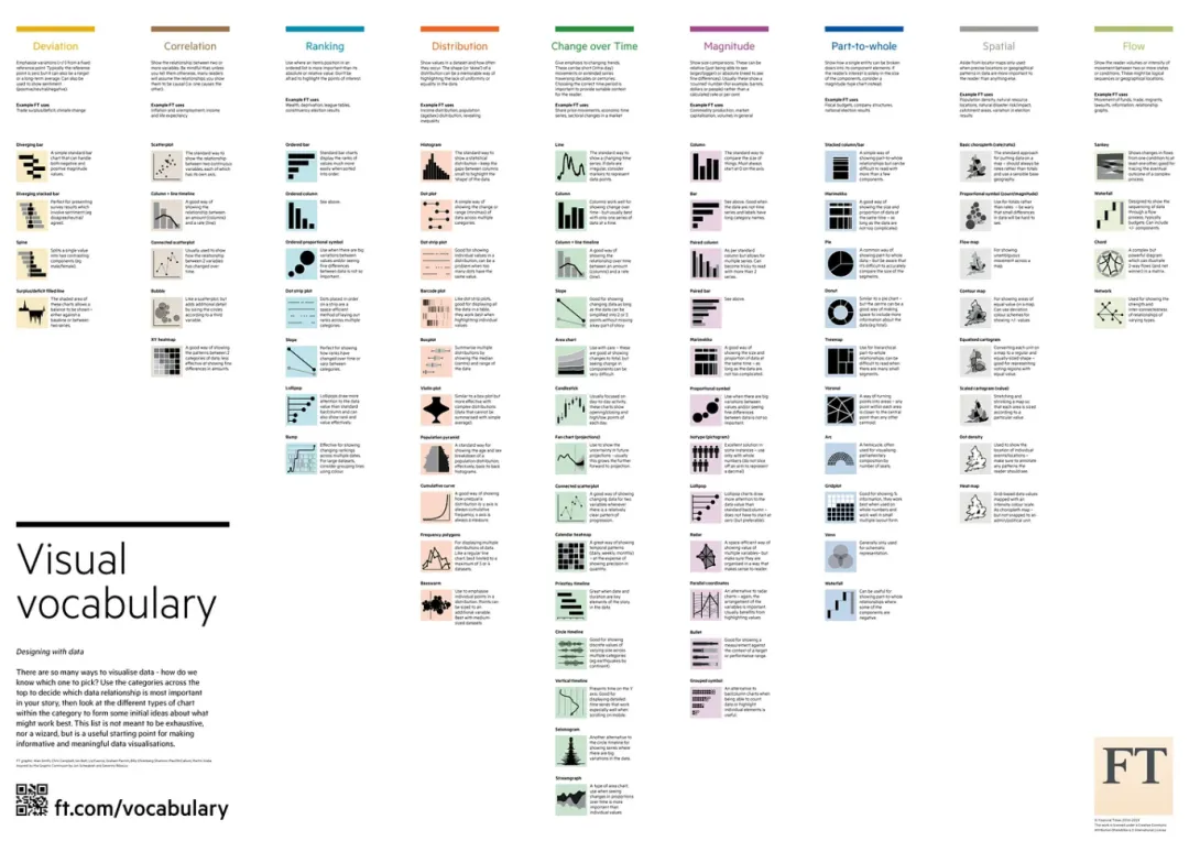
Know the Right Chart for Each Purpose
Choosing the correct chart type is critical for effective data communication. Charts like pie charts or polar charts aren’t always the best choice. Common chart types include: bar charts (comparison), line charts (trends), stacked charts (part-to-whole), KPI cards (quick overview), tables (exact values), distribution charts (histograms, jitter plots), and relationship charts (scatter plots). Mastering these will meet most data visualization needs.
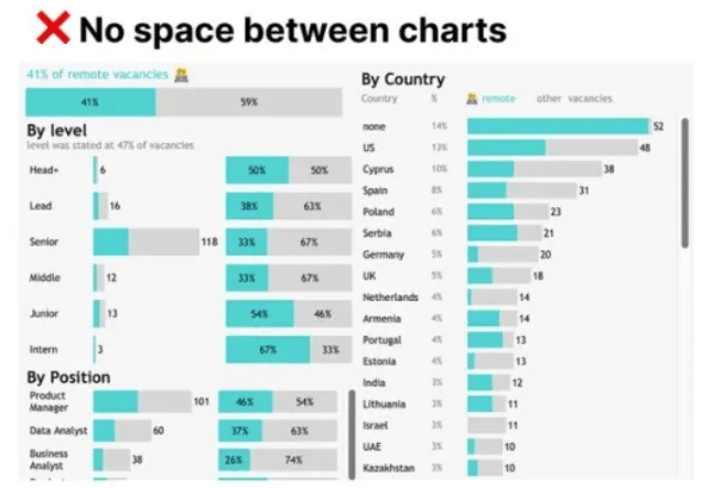
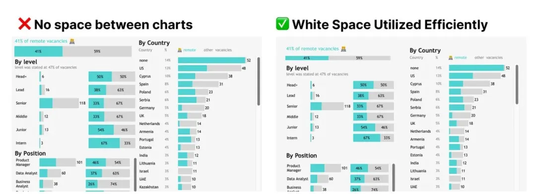
Pay Attention to White Space
White space plays a vital role in visualization, acting like a visual “pause” that gives viewers time to digest information. In Tableau, this can be achieved through padding settings. White space is needed both outside and inside charts to make them stand out.
4px outer padding, 0px inner padding for charts
4-10px outer padding, 8-16px inner padding for chart blocks
16-40px spacing between charts within blocks
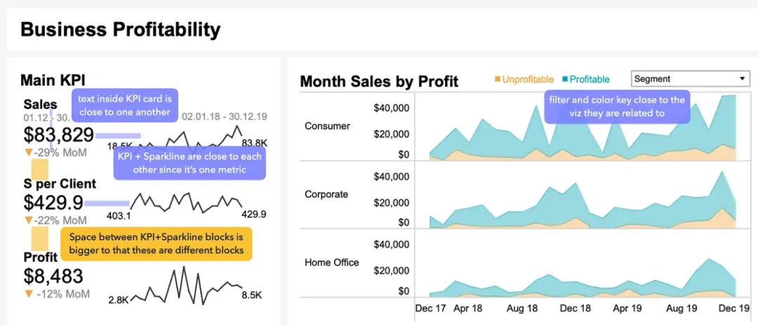
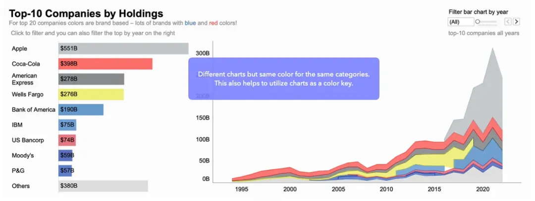
Learn Proximity and Similarity Principles
Proximity and similarity are two key design principles from Gestalt theory that significantly enhance data visualization effectiveness.
Proximity Principle
Group related legends, labels, and chart elements together to form visual wholes, improving data readability.
Similarity Principle
Use consistent colors, fonts, and shapes to create visual connections that guide viewers’ eyes and highlight key information.
Conclusion: Simplicity Is Key
A good dashboard isn’t just about displaying data—it’s about communicating information. By following these principles, you can create more engaging and understandable dashboards that give greater power to data analysis.