


From Overview to Insight: 7 Essential Visualizations for Enterprise Sales Analysis

In the daily work of sales teams, making decisions based on “gut feeling” often means missed opportunities. Only by leveraging data can the team focus their energy on the most important customers, the most valuable opportunities, and the processes that most need follow-up.
However, creating truly useful Tableau dashboards that the sales team will actually use can involve many considerations—and it can feel overwhelming.
Don’t worry! Today, we’re sharing 7 classic sales analytics dashboard examples, exploring the problems they solve so you can create more useful, efficient sales reports for different users~
01 Quarterly Sales Forecast Dashboard
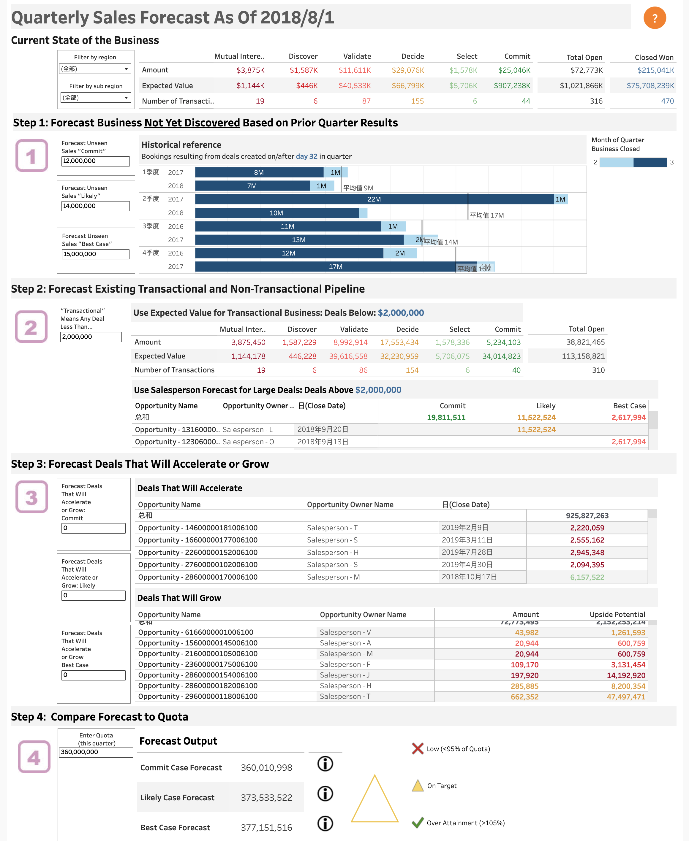
As shown below, this dashboard is primarily for sales analysts to systematically and structurally conduct quarterly sales forecasting. It’s not just a forecasting calculator, but also a practical data analysis tool.
With a single page, you can get a comprehensive overview of all sales opportunities, pipeline distribution, progress at each stage, and which potential deals are likely to accelerate or grow in the future.
More importantly, it allows you to compare various forecast scenarios (committed forecast, possible forecast, best forecast) against quarterly goals in real time, helping the team identify risks early and course-correct before it’s too late.
》Dashboard Breakdown
👉 Current Business Overview
The top view displays key metrics such as total value, number of opportunities, and expected revenue to quickly present overall progress for the quarter. You can filter by region, salesperson, and other dimensions to understand performance across different segments.
👉 Step 1: Forecast Undiscovered Opportunities Using Historical Data
The “Historical reference” section at the top left uses data from past quarters to estimate potential business not yet uncovered this quarter. For example, based on how many new opportunities emerged at each stage in previous quarters, it reasonably predicts how many new opportunities may still arise this quarter. This helps identify hidden sales potential early for more complete forecasting.
👉 Step 2: Analyze Existing Pipeline Opportunities, Including Large Deals
Breaks down the transactional and non-transactional pipeline. Opportunity value and count at each stage, as well as close probabilities, are clearly displayed. High-value deals (e.g., over $2 million) are shown and tracked separately to provide a specialized view of key accounts.
👉 Step 3: Identify Opportunities Likely to Close Faster or Grow
The dashboard lists opportunities likely to accelerate or grow soon, including the responsible salesperson, expected close date, and amount—helping the team prioritize the most convertible customers to improve overall win rates.
👉 Step 4: Compare Forecasts Against Targets
The bottom section is the “results output zone,” showing performance forecasts under various scenarios (committed, possible, best), with visual indicators (red/yellow/green) to highlight gaps with targets. Alerts are triggered if forecasts fall short, allowing for timely strategy adjustments.
》Typical Use Cases
- At the beginning of each quarter, analysts use this dashboard to aggregate global data, forecast quarterly sales, and compare forecast types with target KPIs (YoY).
- Management uses the data during monthly or quarterly meetings to support decisions, such as whether to adjust incentives or reallocate resources.
- Sales teams monitor key clients and large opportunities in real time to avoid missing high-value leads.