


Enterprise Data Empowerment | Template Showcase: Interactive Sales Dashboard
Today, we’re sharing a Tableau analytics template: an interactive sales dashboard created by Andy Kriebel. This dashboard enables real-time data monitoring, helping sales teams better understand market trends and enhance competitiveness.
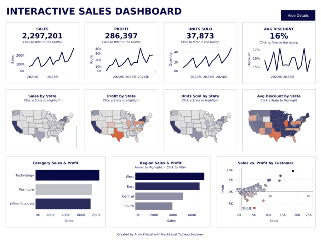
Dashboard Overview
This marketing campaign dashboard consists of a single section: Overview. The top-right corner features display control buttons, allowing users to collapse or expand the chart modules below, including category analysis, regional performance, and customer tier analysis.
Key Insights
This dashboard provides a clear view of:
-
Core business metrics: total sales, profit levels, sales volume, and average discount.
-
Geographic distribution of sales, profit, volume, and discounts across states.
-
Sales and profitability by product category.
-
Regional market performance.
-
The relationship between sales and profit across customer tiers.
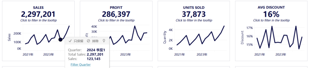
1. Top Section: Trend Analysis (Line Charts)
The four line charts at the top display sales, profit, volume, and average discount over time. Clicking any time point filters the data for that quarter, dynamically updating all linked charts below for deeper analysis.
-
Sales: Shows total revenue per quarter, reflecting overall business performance.
-
Profit: Displays quarterly profit levels, helping evaluate cost control and profitability.
-
Volume: Tracks the number of units sold, measuring demand and operational efficiency.
-
Average Discount: Reveals seasonal discount trends, analyzing the impact of promotions on sales and profit.
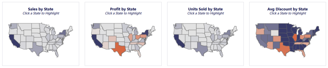
2. Middle Section: Heat Maps
The four heat maps visualize sales, profit, volume, and average discount at the state level. Clicking any state filters the “Regional Sales & Profit” chart below, revealing performance across states within the selected region.
-
Sales: Identifies high-revenue states (darker colors = larger sales).
-
Profit: Highlights high-profit vs. high-sales states, uncovering cost optimization opportunities.
-
Volume: Shows demand distribution and sales activity.
-
Average Discount: Compares promotional strategies across regions.
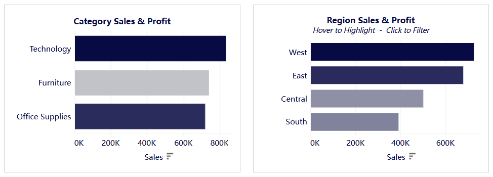
3. Bottom Section: Bar Charts (Category & Region Analysis)
Two bar charts break down sales and profit by product category and geographic region, helping users identify structural trends.
-
Category Analysis: Compares sales and profit across product lines, revealing high/low-performing categories.
-
Regional Analysis: Clicking a region filters all linked charts (trends + heat maps), enabling focused performance reviews.
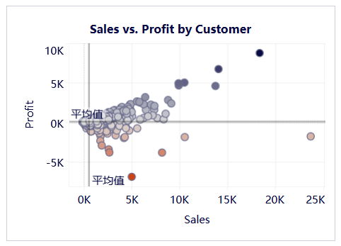
4. Customer Tier Analysis (Scatter Plot)
Each dot represents a customer, plotted by sales (X-axis) and profit (Y-axis). This helps identify:
-
High-value clients (high sales + high profit).
-
Low-efficiency clients (high sales but low profit, or vice versa).
Conclusion
Leveraging Tableau’s agility, ease of use, and data visualization strengths, this dashboard delivers insights in a direct, efficient, and intuitive way. It empowers data-driven decision-making, fosters a culture of analytics, and fuels business growth!