


Best Practices | Visualize Financial Metrics with Tableau Extensions to Enhance Banking and Loan Analysis
In the banking and financial sectors, organizations often need to track multiple dimensions of financial metrics simultaneously—maintaining a macro view of business trends while also drilling down into individual records to identify risks and opportunities in a timely manner.
However, traditional reporting tools struggle to meet the real-world needs of being efficient, flexible, and visually appealing. As a result, more analysts are turning to Tableau extensions to bring financial visualizations closer to business operations.
Take bank loan analysis as an example. Business teams want a single dashboard that dynamically tracks loan issuance, repayments, and defaults across different loan types, while also profiling customers to support risk management and targeted marketing.
To meet such demands, you can use visualization extensions like PowerKPI and SuperTables to enable end-to-end data visualization and intelligent analysis.
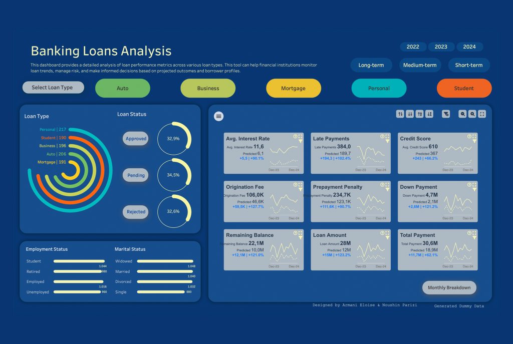
Financial Metrics Dashboard
The dashboard below combines PowerKPI and SuperTables to deliver a smart visualization solution that integrates multidimensional monitoring, dynamic comparisons, customer insights, and detailed data tracing.
This dashboard helps track key indicators such as loan balance and default rate in real time (cards), and also supports flexible dimensional analysis—filtering by year, loan type, or customer profiles (e.g., marital status, employment)—to reveal business trends dynamically.
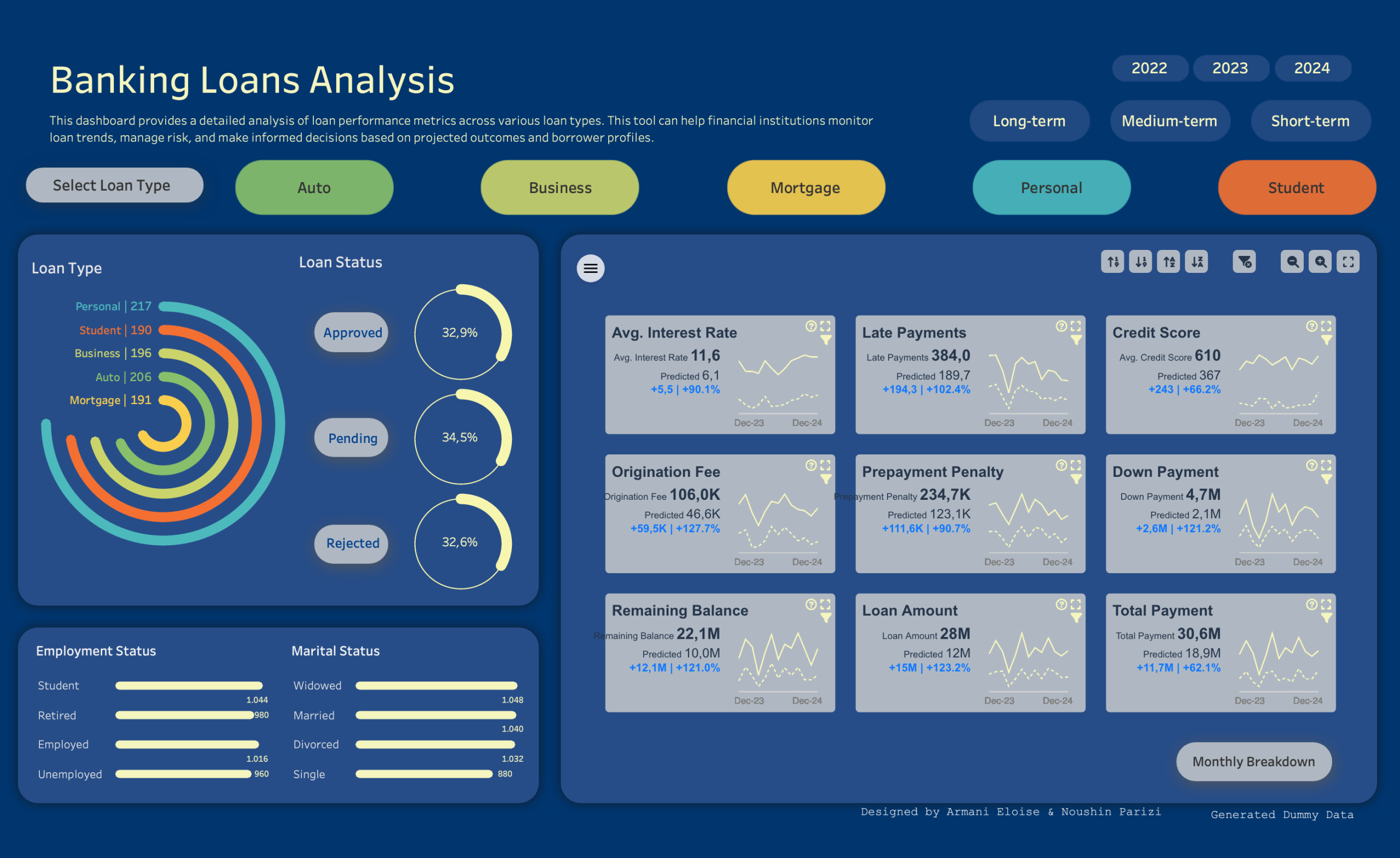
With the PowerKPI extension, actual and predicted values are displayed side by side, with changes and deviations highlighted to help management monitor goal progress and adjust strategies promptly.
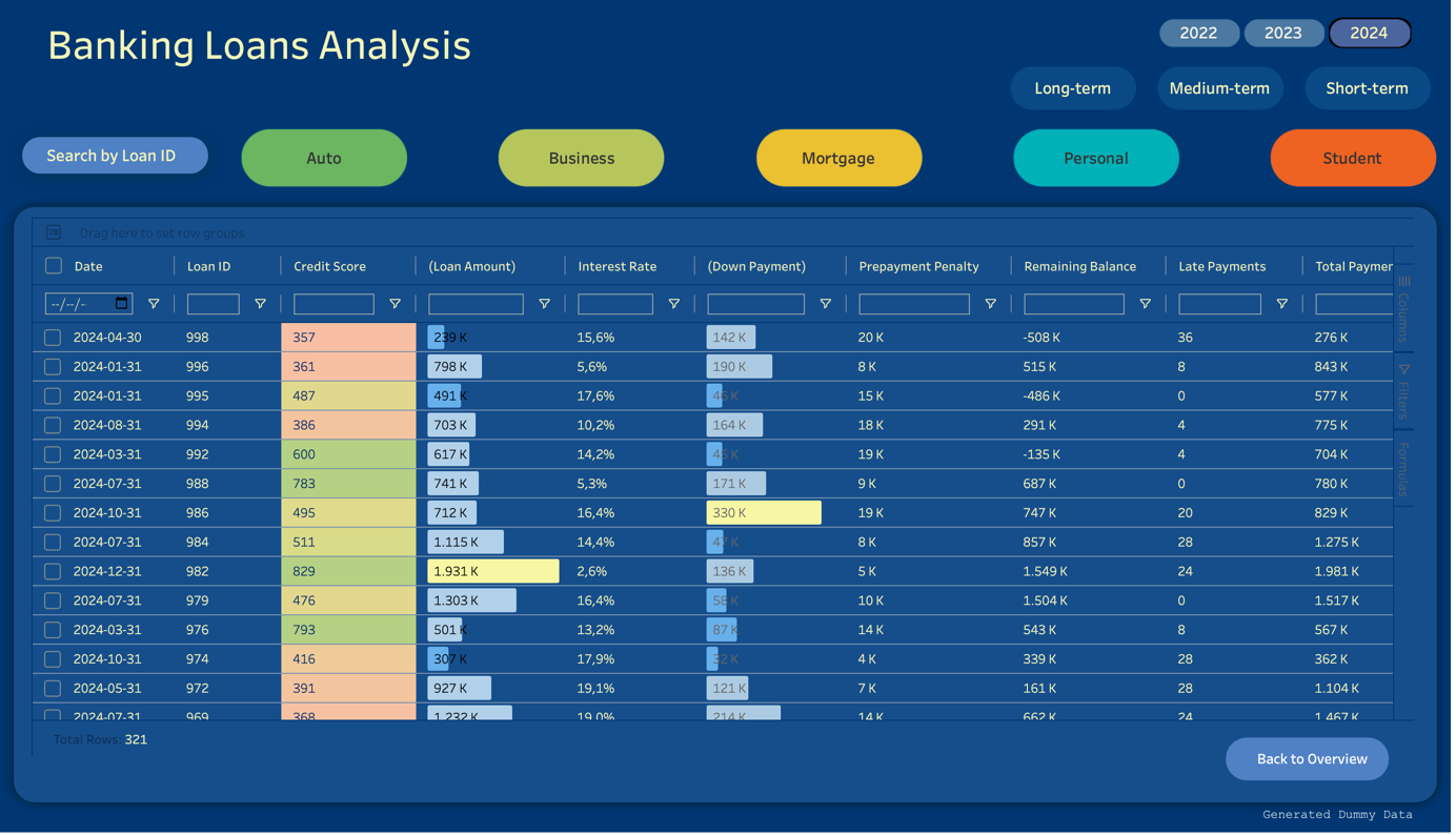
The SuperTables extension enhances retrieval and drilling into detailed data, enabling one-click access to business records and historical data directly within the dashboard—greatly improving audit and risk control efficiency.
With this solution, both decision-makers and front-line analysts can collaborate efficiently within a single interactive interface to drive business growth with data.
Steps to Build a Financial Metrics Dashboard
#1 Data Import
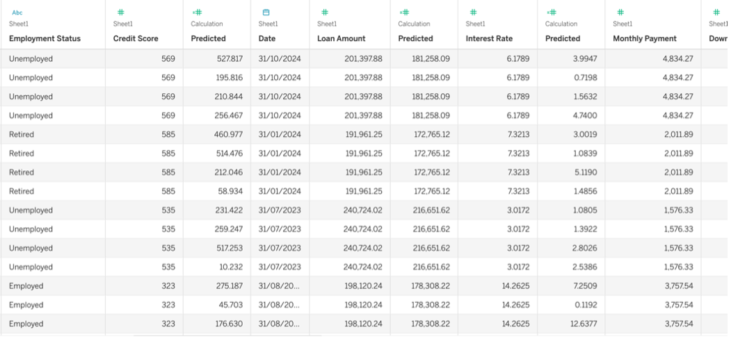
Adding PowerKPI to a dashboard is straightforward. First, import a structured loan dataset into Tableau.
As shown in the figure below, the sample dataset includes key information such as year, loan type, loan status, amount, and predicted values. This enables multi-level filtering and comparative analysis across different dimensions.
#2 Create Actual + Predicted KPI Cards
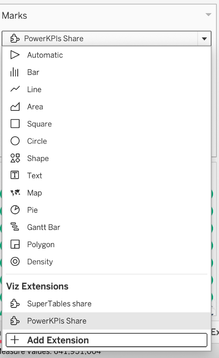
To use the PowerKPI extension, go to the “Marks” card in a Tableau worksheet, click “Add an Extension,” and search for “PowerKPI” to download and install it.
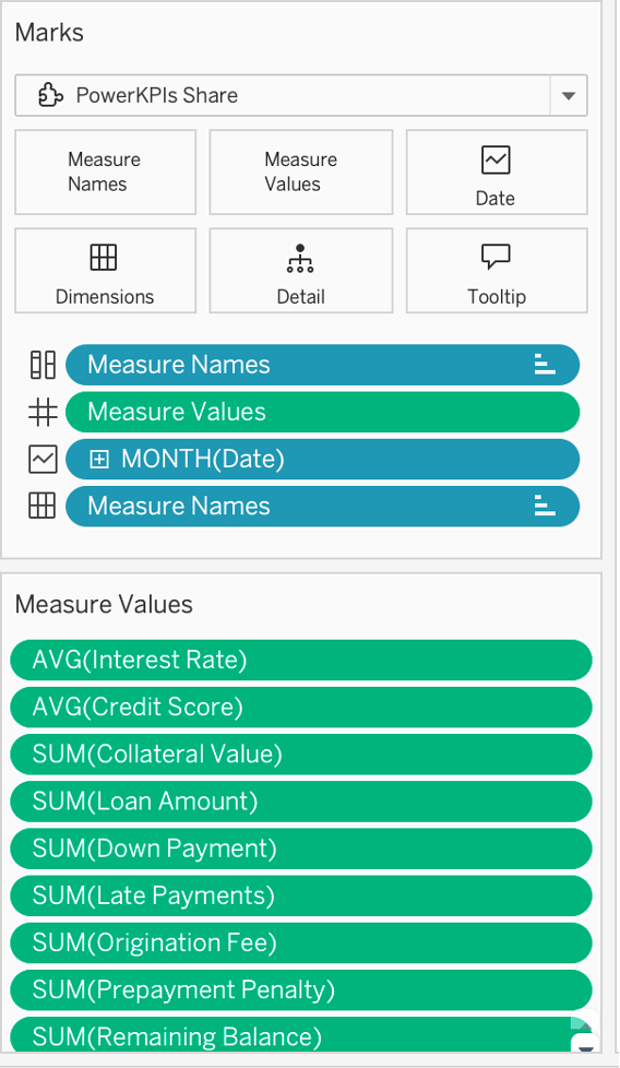
Then, drag actual measures like “Loan Balance” and “Default Rate,” along with corresponding “Predicted” measures, into the relevant fields of the Marks card.
The PowerKPI extension will automatically recognize and display actual vs. predicted values on each KPI card. You can freely adjust the layout, colors, and icon styles to achieve an enterprise-grade visualization experience.
Note that to display dashed lines (representing predicted values) correctly, each actual measure must have a corresponding predicted measure named “Predicted.” PowerKPI will automatically read and distinguish actual vs. predicted data for each card.

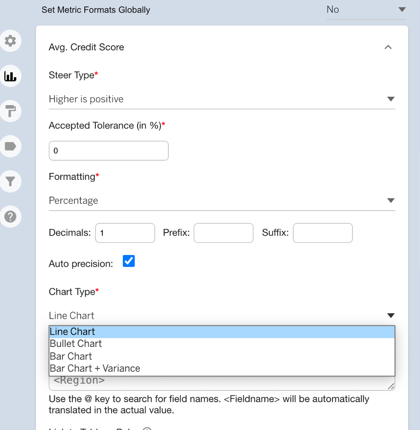
As seen in the gif, PowerKPI offers an intuitive configuration interface. You can choose the card layout (e.g., grid or tree), define the dimension members each card represents (e.g., different loan types), and assign main and comparison values. Differences from predicted values are calculated and highlighted automatically.
You can also use the Format tab to set positive/negative color schemes, and the Chart tab to assign different chart types to each indicator—enabling highly customized, intuitive, and efficient analysis.
 、
、
Best of all, all settings support real-time previews, greatly improving the dashboard-building experience.
Enable Drill-Down and Interactive Analysis
After setting up the KPI cards, you can use the same method to enable the SuperTables extension for enhanced detailed data analysis.
Next, drag detailed fields such as Loan ID, customer info, and disbursement time into the SuperTables configuration panel. Business users can then click buttons like “Monthly Overview” to switch to detailed views, quickly locate specific loans or records, and use powerful built-in search, filter, and sorting features to find data efficiently.
Free Trial of Tableau Extensions
Whether it’s financial lending, budget management, or risk monitoring, seamless integration of PowerKPI and SuperTables empowers both business users and decision-makers to track macro trends and drill down into every key data point—delivering full-process, full-scenario intelligent financial metric visualization.
👉 If you would like to deploy these extensions to your enterprise Tableau Server or Cloud environment after the free trial, please click here to unlock the premium features, or contact us for consultation and purchase.
👉 The premium version of PowerKPI not only supports integration with Tableau Pulse metrics, but can also be used together with the WriteBackExtreme extension to further enhance your business analytics and visualization interactivity!